
Refining Your View
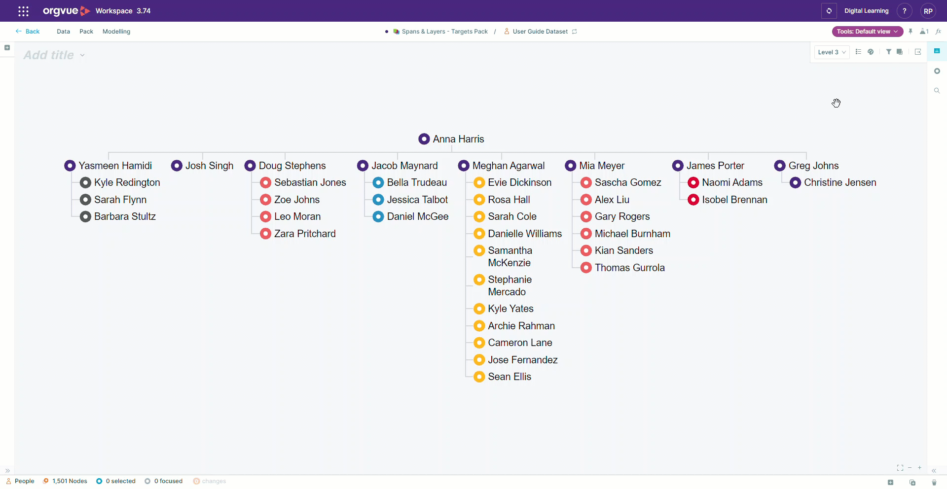
A number of controls are available on Tree, Worksheet and Pivot slides in the top right corner which will allow you to refine the view of the data on the selected slide
The controls are also repeated on each panel of a Multi Slide to enable individual slide refinement
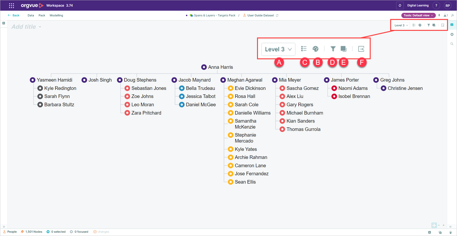
Other slide types will have reduced options available as levels and color controls are not available on all slide types
Visible Levels
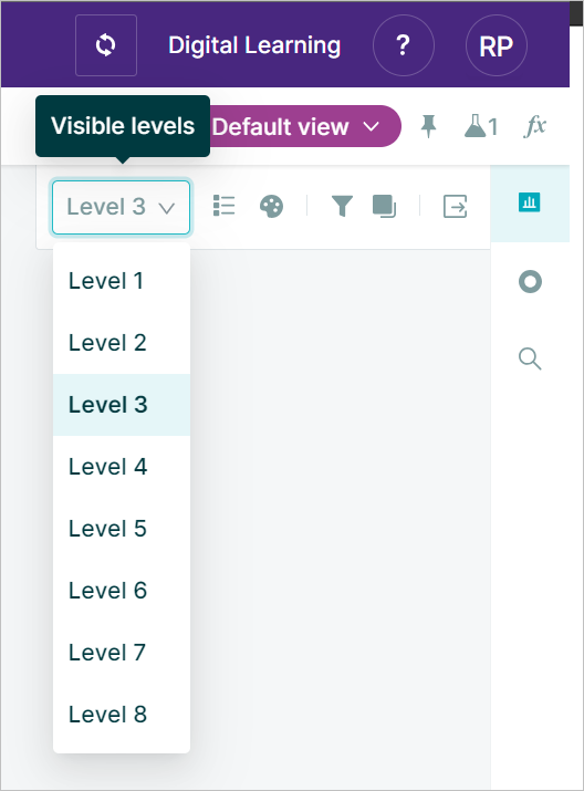
Reduces / expands nodes on the Tree and Worksheet visualizations to the specified level
color control
You can color nodes in visualizations by a single color or split by a selected property either using a multi palette for any property types or heatmap for number properties
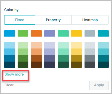
To apply color to nodes select the color by icon
![]()
You can select either:
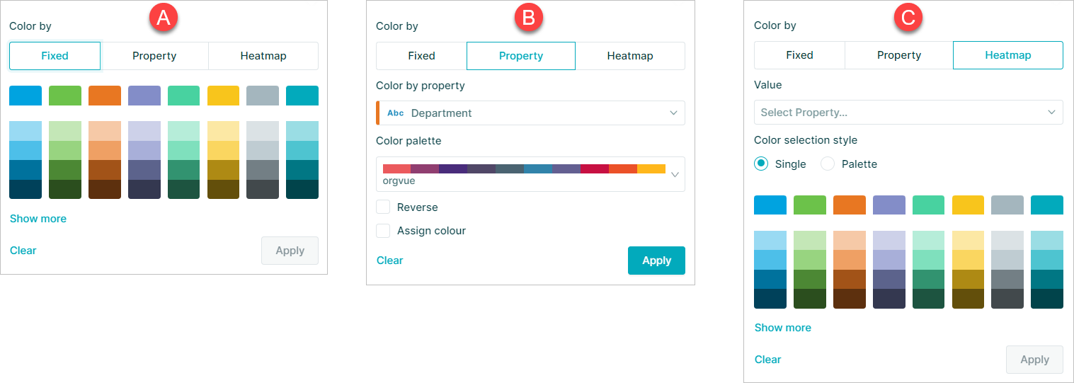
- A. Fixed
- B. Property
- C. Heatmap
Fixed
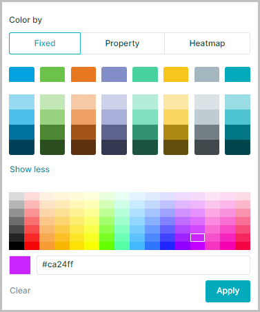
Fixed color allows you to select any color or to use a # hex code to use specific colors by selecting the Show More option
This will open an extended color picker area with the option to enter a color hex code directly
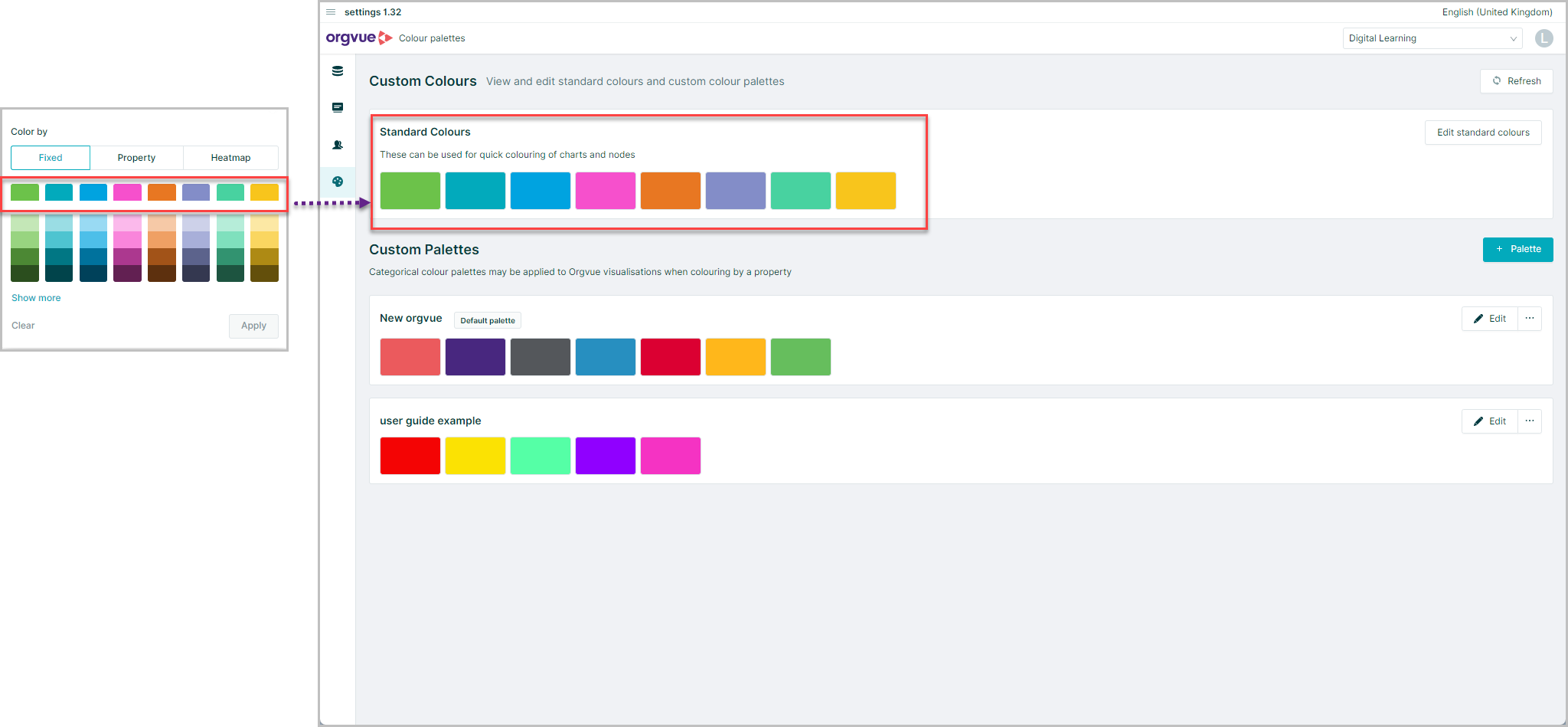
The color palette shown when initially opening the color panel, will be the ones selected on the standard palette in the settings menu
Property
You can select the Property option to color based on the value of a selected property
When you use this function you first need to select a property using the drop-down list or the search function
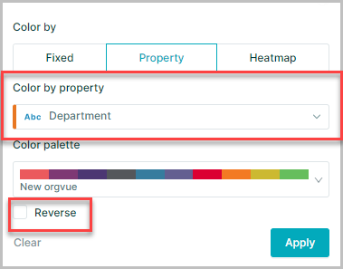
When coloring by a property, the values are assigned a color from the palette in ascending order
There is also a Reverse color option, which is located at the bottom left of the Color by menu. This allows you to reverse the color range of the palette you have chosen
Multi-color Palettes
There are a range of multi-color palettes to choose from, allowing you to highlight your data in the most effective way
Sequential
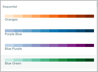
Color palette based primarily on a single base color, with the option of having up to three base colors. There are multiple variations of shades of the base colors, which blend well in visualizations. Great for visualizing measures in a range
Diverging
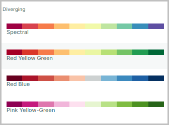
Color palette based primarily on two contrasting base colors, with multiple shade variations of the base color. Also, good for visualizing measures especially with high / low ranges
Categorical
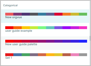
A range of palettes with contrasting colors which are great when coloring by dimensions with up to 30 buckets. Any custom palettes will also appear here
Heatmap
The heatmap option enables the coloring of a visualization based on a number property
It may be applied either:
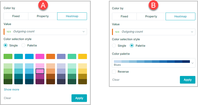
- A. As a single color where larger numbers appear as a darker shade of selected color
- B. Using a Palette as the heatmap with larger and smaller numbers at either end of the palette
Color property values a specific color
It is possible to assign property values a specific color in two ways:
- Via a Lookup Dataset to consistently apply the same colors to specific property values for dataset every time
- Via the Assign color option on the Color Panel to apply colors to specific property values for the selected slide only
Apply color via Lookup Dataset
To view a video showing how to color property values a specific color click the thumbnail to open the video in a new browser tab
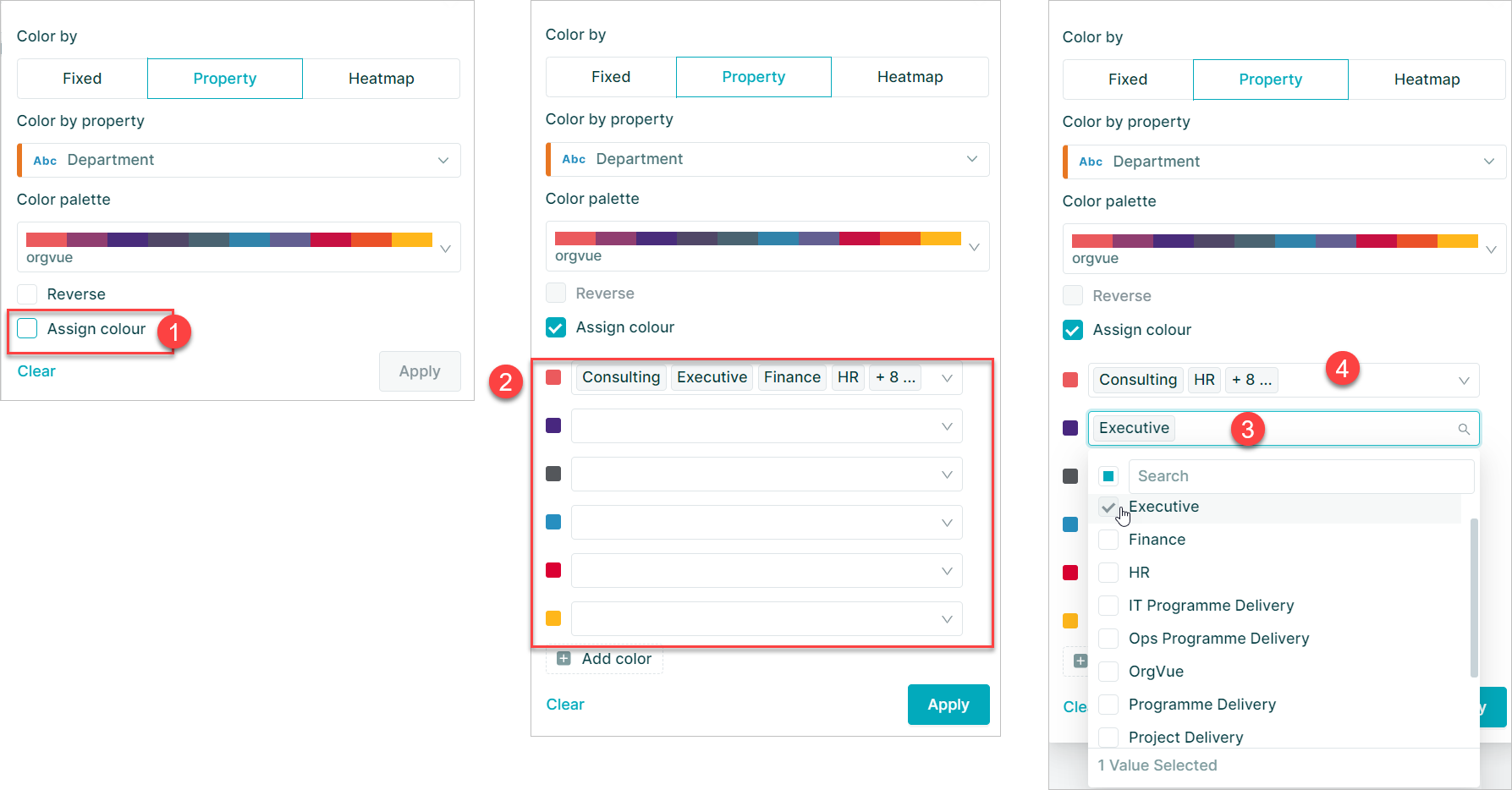
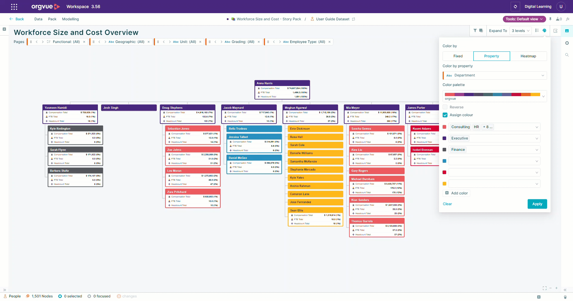
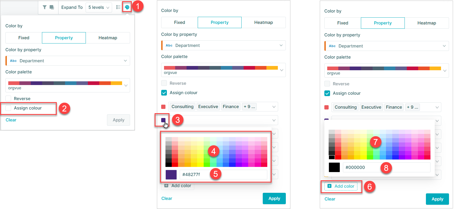
Assign Color via color panel
When coloring by a property Orgvue will automatically assign a color from the selected palette to each property bucket.
It is possible to override the automatic color selection by:
- Select the
Assign Colorcheckbox on the color panel - The color selection panel will be shown with all property buckets initially assigned to the first color in the palette
- Select the property dropdown for a color to assign a property bucket to the color
- If the number of property values is less than or equal to the number of colors in the palette, the property values will be assigned a color in sequence. If there are more property values than colors, all the property values will be assigned to the first color in the palette. You can then reassign them
A property bucket can only be assigned to one color in the palette at any point so assigning a value to a new color in palette will automatically remove from previous selected color
Reassign Colors When Filtering
When applying colors from a palette, property buckets are assigned a color automatically from the palette based on the bucket value low-high with colors being reused if there are more property buckets than colors in the selected palette
If the data is subsequently filtered based on the same property used to color it may result in an uneven distribution of colors
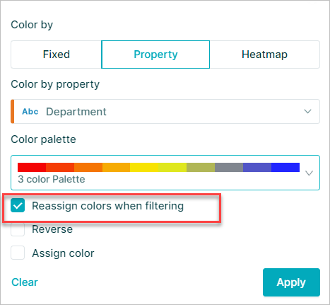
Selecting the Reassign colors when filtering will redistribute the filtered property buckets across the color palette when the filter is applied
Editing Slide Color Palette
When using a color palette it is possible to edit the colors available for the current slide to either add additional color options or change individual colors
To edit the colors:
- Select the
Color Byicon to open - Select the
Assign colorto open the color selection panel - Select the
colorto be edited - The new color may be selected from the color picker
- A color hex code may be entered to add a new color
- Select
+ Add colorto add a color to existing palette - New colors may be added from color picker
- Or added via Hex code
Saving the Pack will save the edited color palette for the current slide
Create Slide Color Palette
If none of the saved palettes are suitable it is possible to create a custom color palette for use on the currently selected slide by:
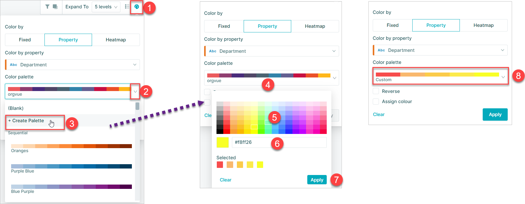
- Select the
Color Byicon to open - Select the
Color palette dropdown - Select the
+ Create Palette - This will open the color picker
- The colors may be added to palette by selecting the color picker
- A color hex code may be entered to also add a color to the palette
- Select
Applyto finish the palette creation - The new custom color palette will be selected in the dropdown
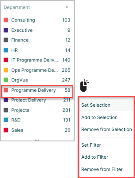
Color Legend
When you select multi-color, you get an additional Color Legend option
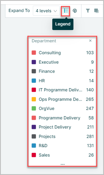
The Color Legend shows you the distribution of your selected property by the color palette you have chosen
Right-clicking on any bucket within the color legend will open the additional menu to enable the nodes in the bucket to be added and removed from selections and filters
The color legend may be dragged around the canvas and resized by dragging the edges as required