Boxgrid
The Boxgrid is a slide type available to add to any pack
This functionality plots an aggregated value displayed by two properties in rows and columns
It is a data summary table that provides aggregate data statistics grouped together in meaningful ways
The values are presented in the boxes colored as a heatmap of a single selected color from the color palette
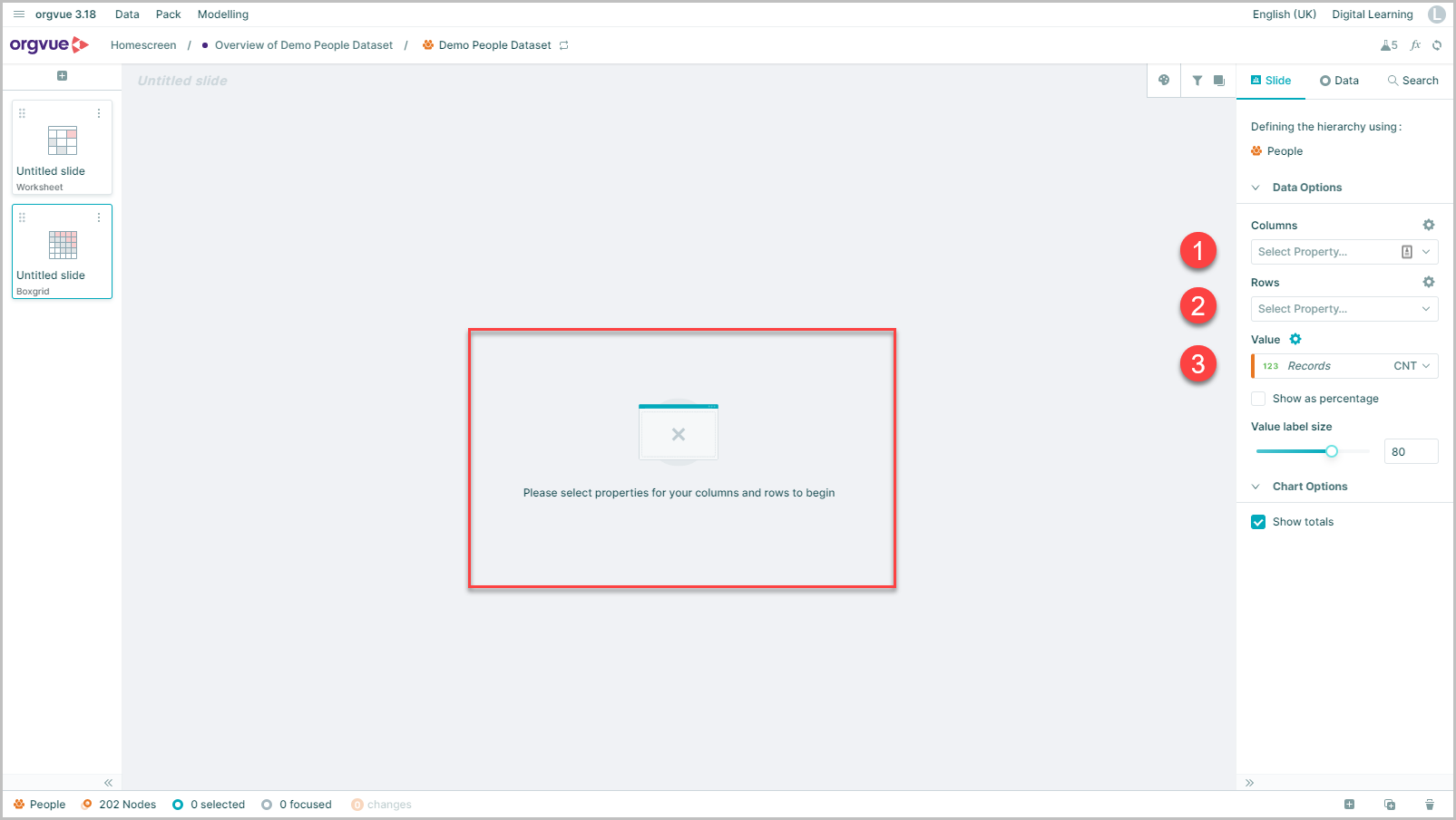
By default, when a new Boxgrid slide is added to a pack a message will be displayed on the canvas to select properties for:
Columns
Use the dropdown menu to select property to split across the table columns
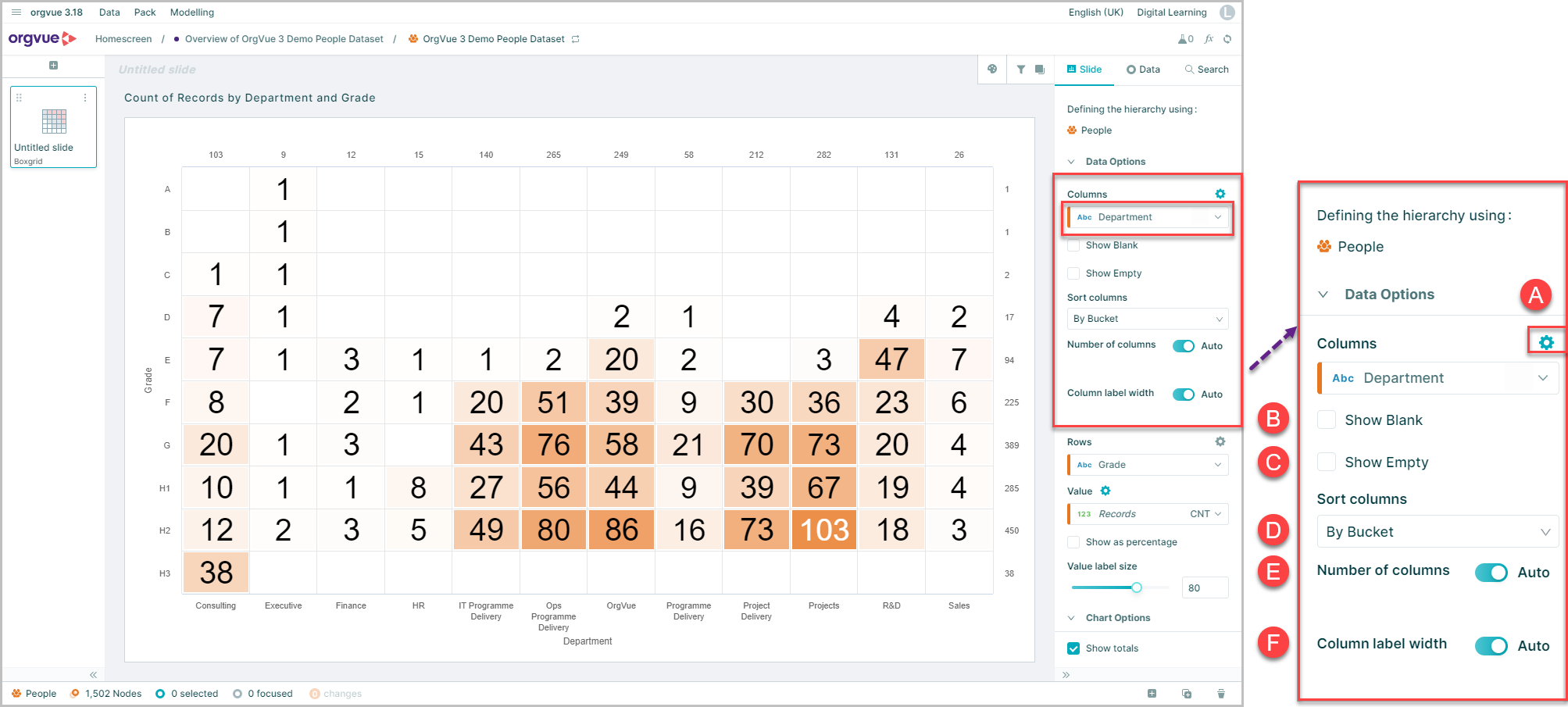
Further settings Cog (Columns)
- A. Click to open menu
- B. Show Blank: Enable this option to include a data point for blank values
- C. Show Empty: Select this option to include data points for empty data buckets
D. Sort Dropdown selection to set sort order of columns with choice of:
- By Bucket
- By Bucket reversed
- High to Low
- Low to High
- E. Number of Columns: Default setting of auto will display all. Switching auto selector off enables a slider control to adjust number of columns displayed
- F. Label Width: Default setting of auto will display all. Switching auto selector off enables a slider to adjust the width in label area
Rows
Use the dropdown menu to select property to split across the table rows
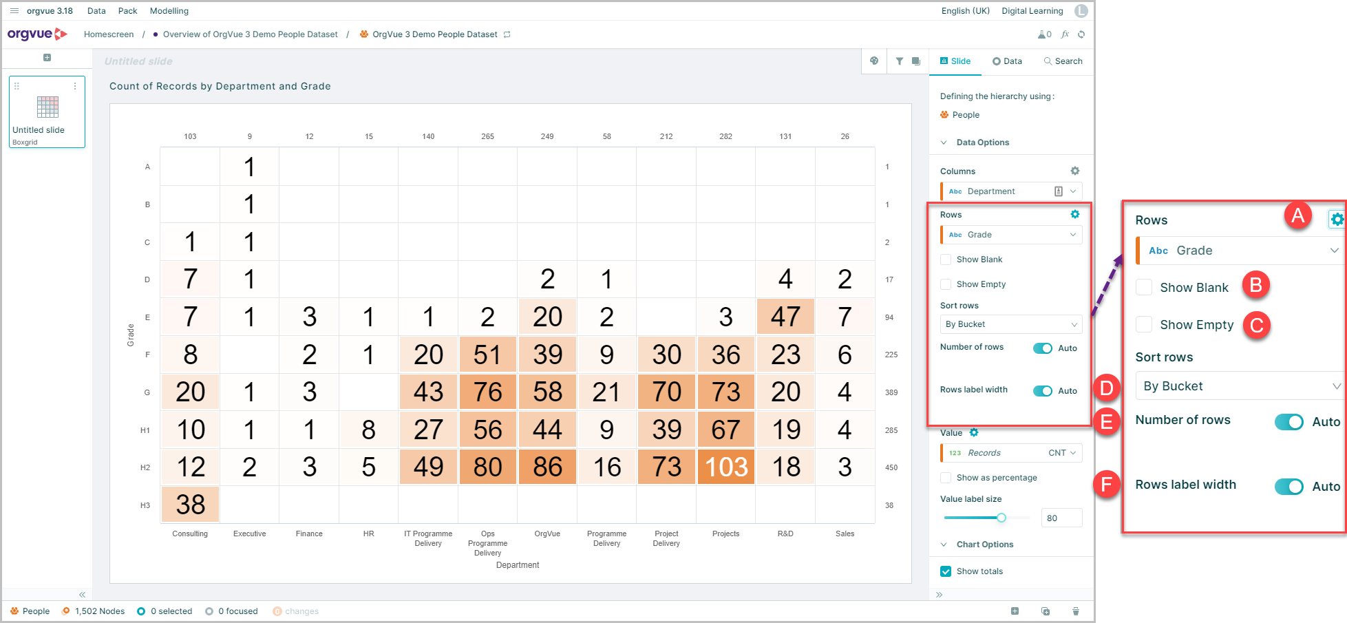
Further settings Cog (Rows)
- A. Click to open menu
- B. Show Blank: Enable this option to include a data point for blank values
- C. Show Empty: Select this option to include data points for empty data buckets
- D. Sort: Dropdown selection to set sort order of chart bars with choice of:
- By Bucket
- By Bucket reversed
- High to Low
- Low to High
- E. Number of Rows: Default setting of auto will display all. Switching auto selector off enables a slider control to adjust number of rows displayed
- F. Label Width: Default setting of auto will display all. Switching auto selector off enables a slider to adjust the width in label area
Value
Use the dropdown menu to select property and aggregate method to display across the split across the table grid
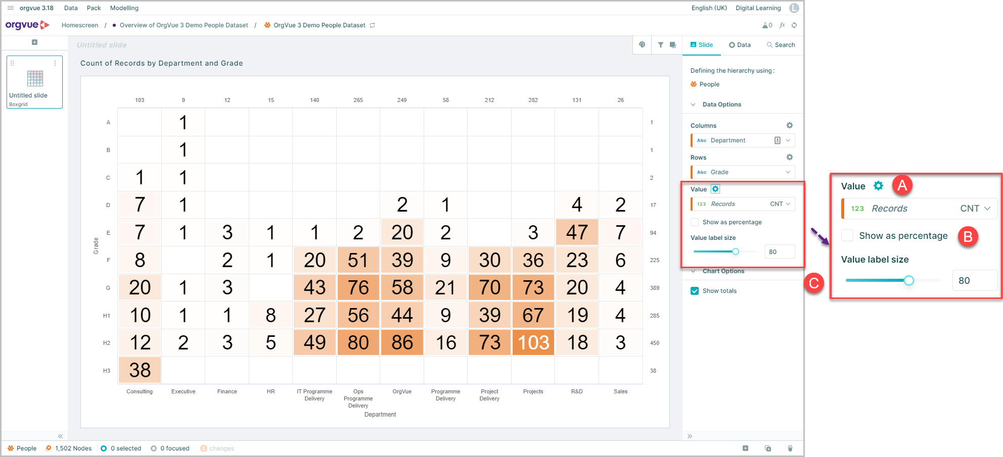
Further Settings Cog (Value)
- A. Click to open menu
- B. Show as Percentage: Enable this option to display values as a percentage of total
- C. Value label size: slider control or up/down selection buttons to adjust size of data point labels
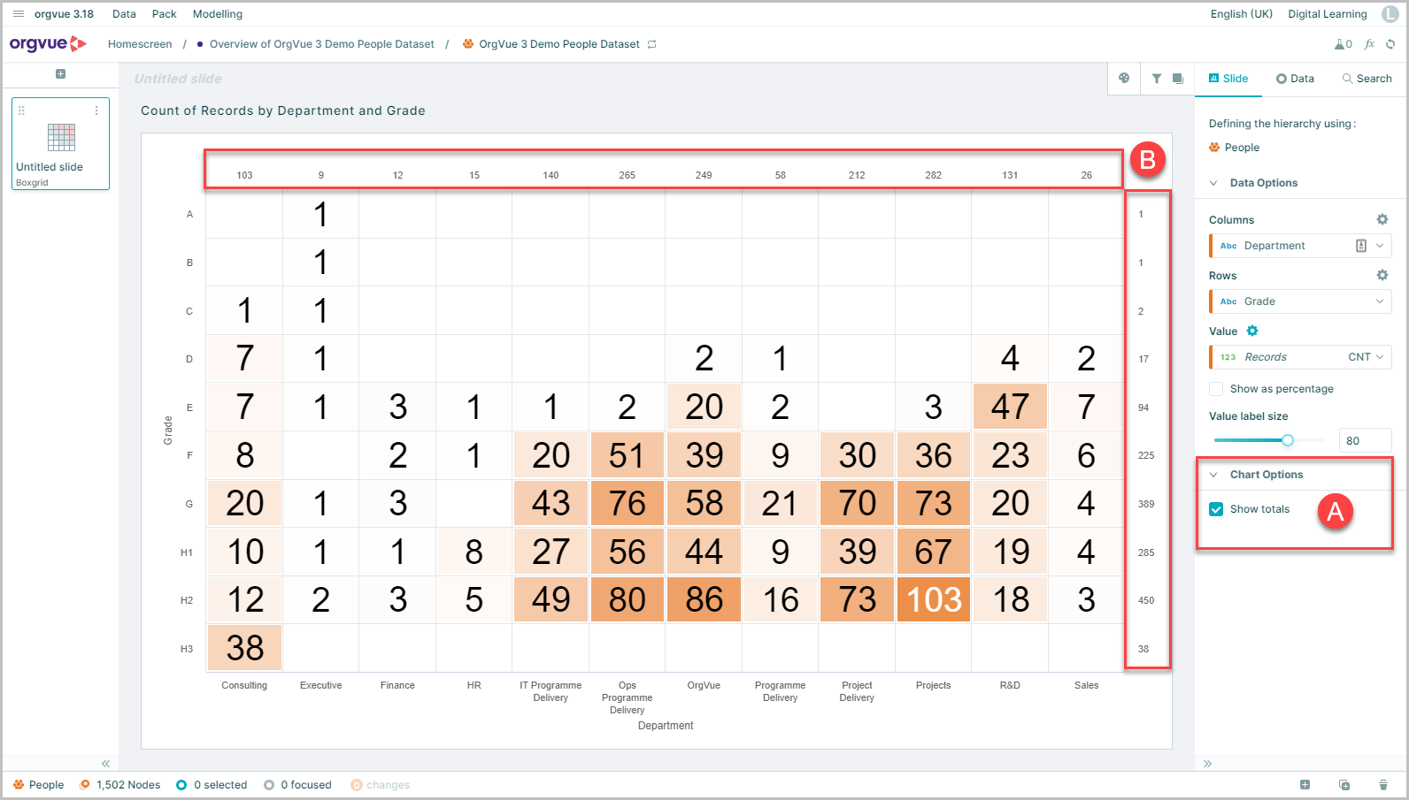
Chart Options
Option to display row and column totals
- A. Select the
Show totalscheckbox - B. Totals for rows and columns are then displayed
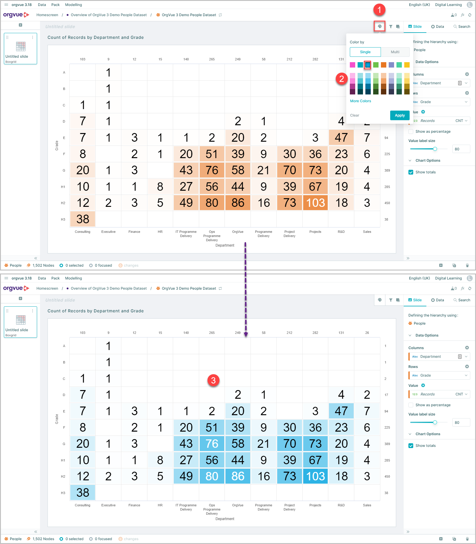
Boxgrid Color
Values in the boxgrid are displayed using a heatmap of a single color which can be changed by:
- Selecting the Color Control button
- Select the single color from the color picker
- The selected color will be applied as a heatmap with the largest values shaded darker