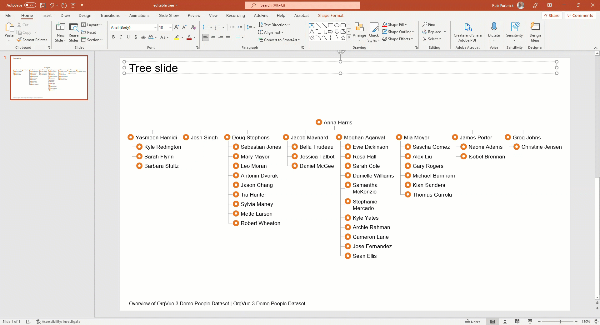
Tree Slide
The tree slide is available to add to any pack using the Add Slide Button and allows the visualization of hierarchical data using a variety of graph types
Options to customize the way the tree is displayed are available on the Slide Tab
Tree Slides are added with the Visible Levels control set to 3 Levels initially
The example trees shown for each style have all been produced using
- The same dataset
- Levels set to show 4 levels of the hierarchy
- Default layout options for each style
- Nodes colored by department using the same color palette
This will allow comparison between the different tree styles on the amount of node detail shown in each
For detail on the options available to change the tree layout see Tree Slide Layout Options
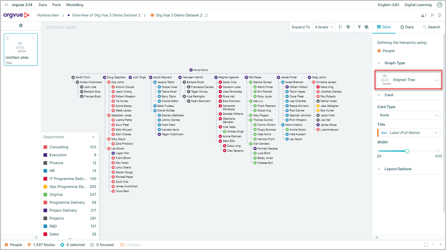
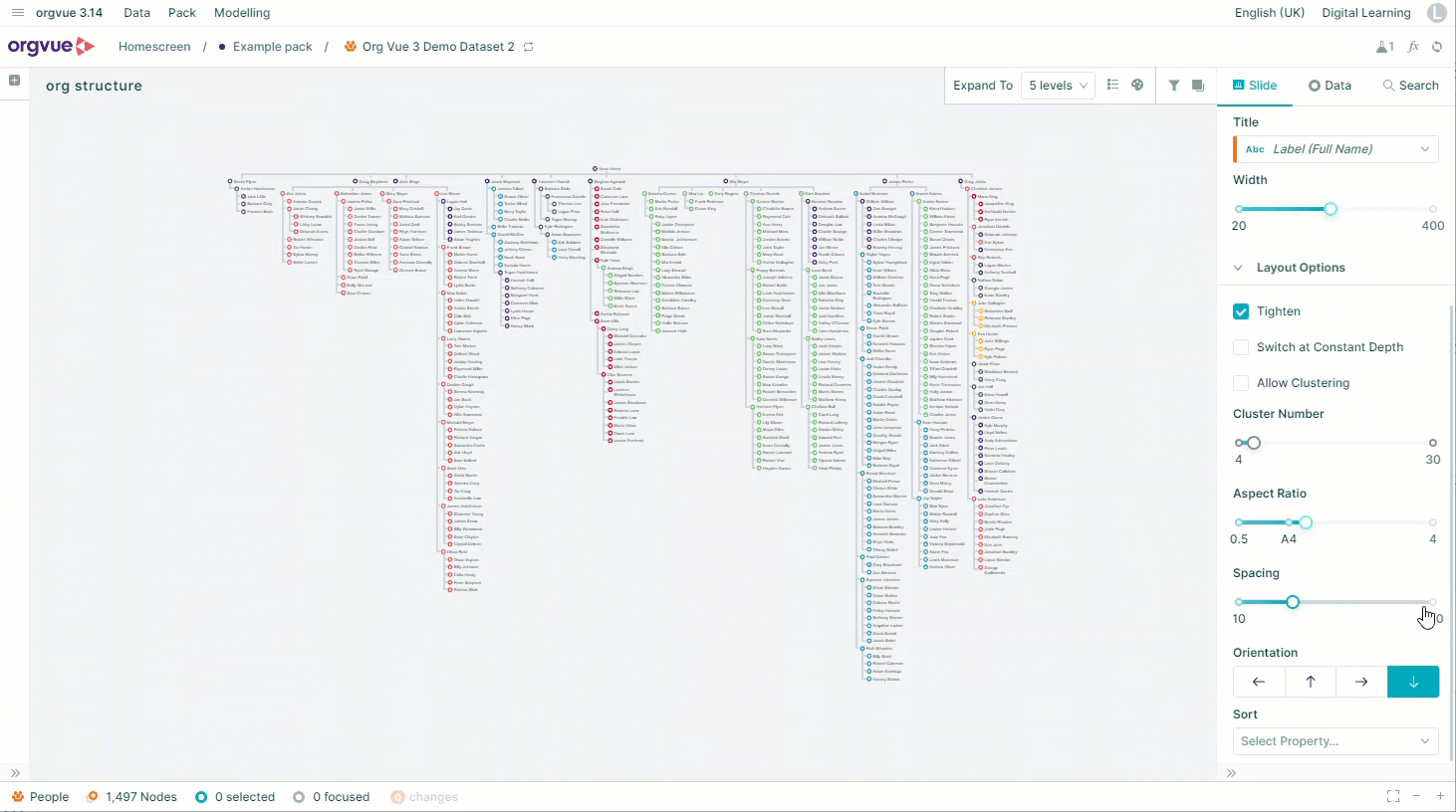
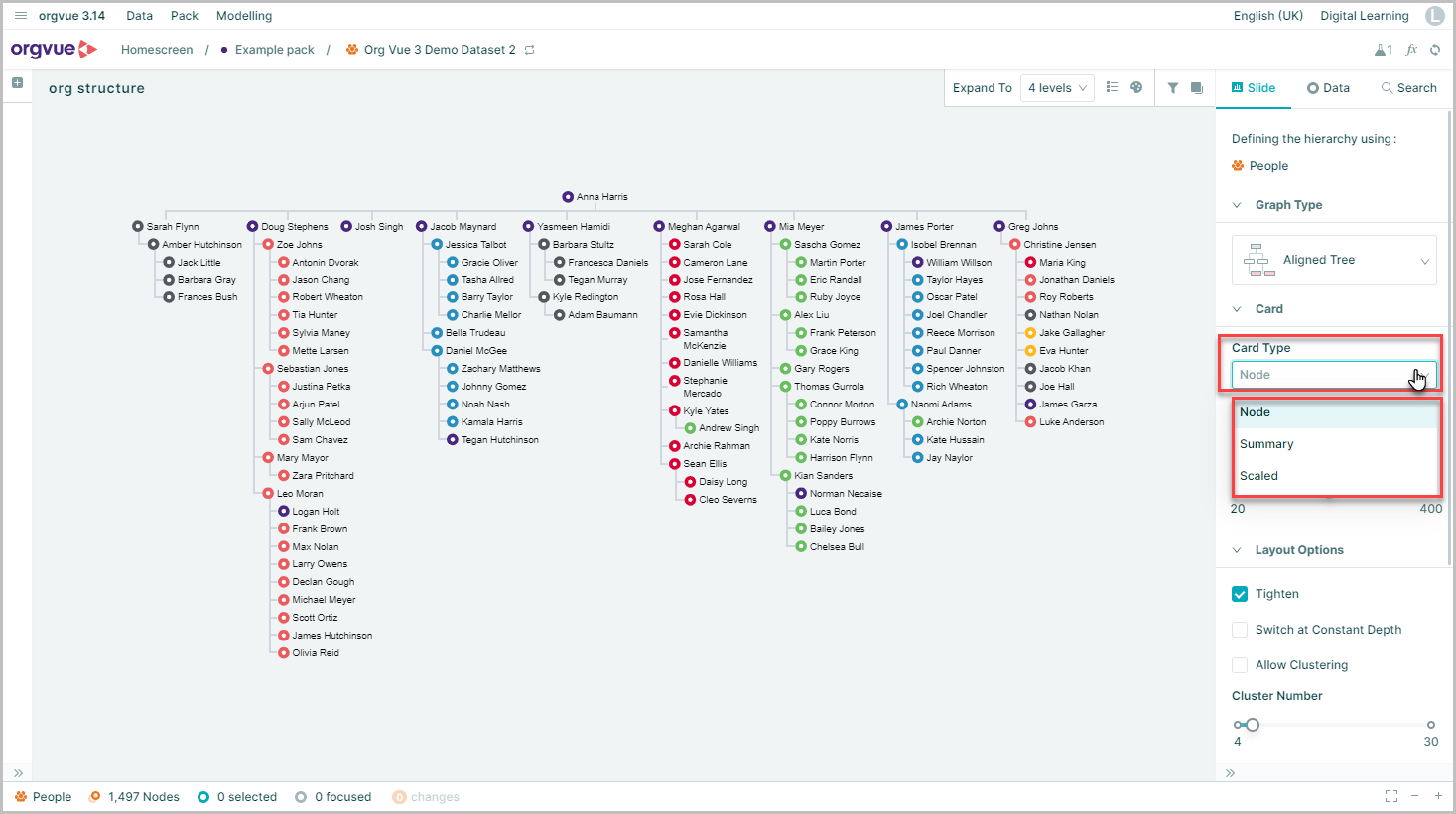
Aligned Tree
This is the default graph type displayed when adding a tree slide to a pack
Nodes are displayed directly below each other with nodes at each depth of the hierarchy aligned with each other
This is the most common type of tree visual used but does require a large canvas area to effectively display the tree, this can be at the expense of node detail being shown
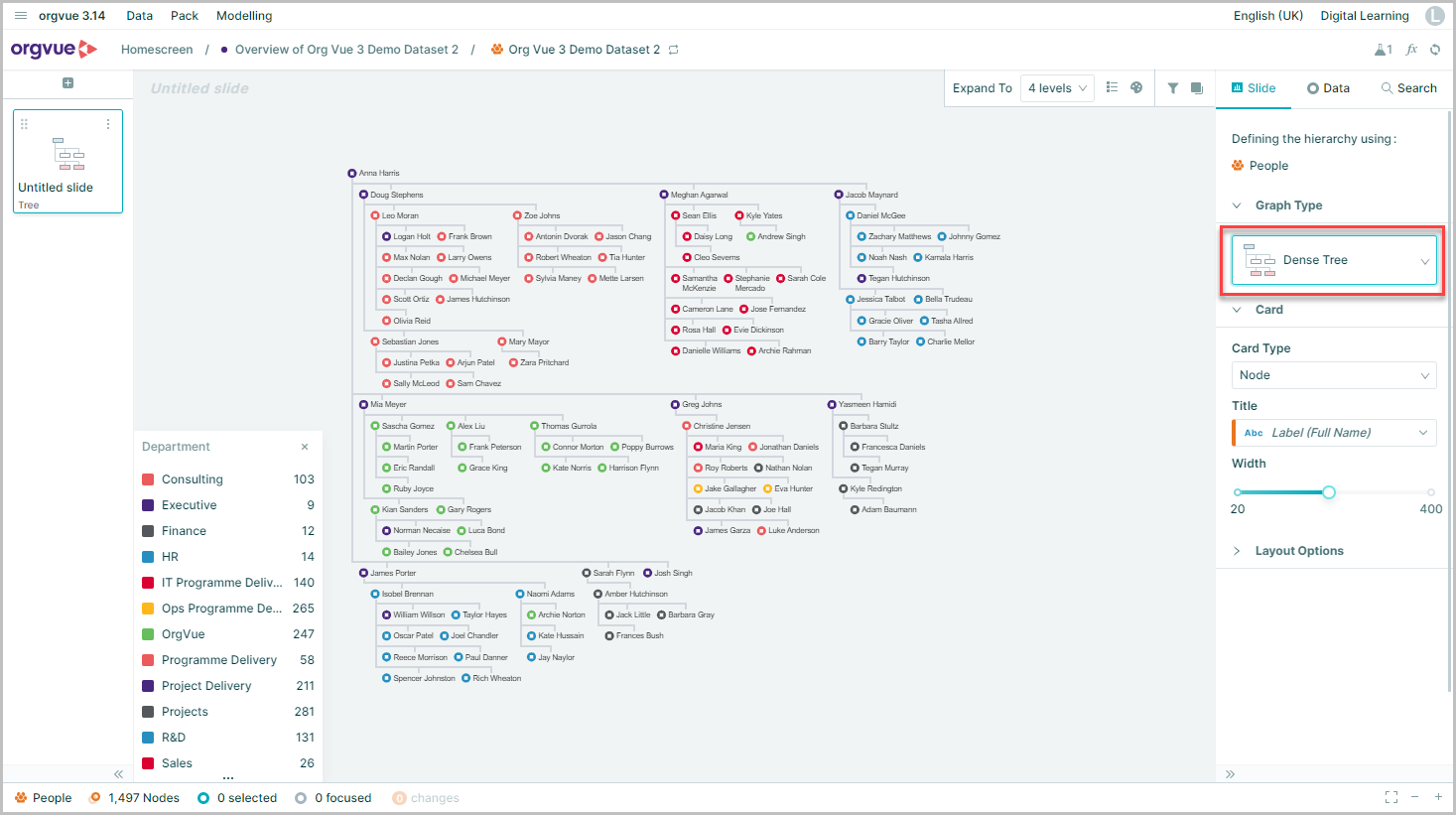
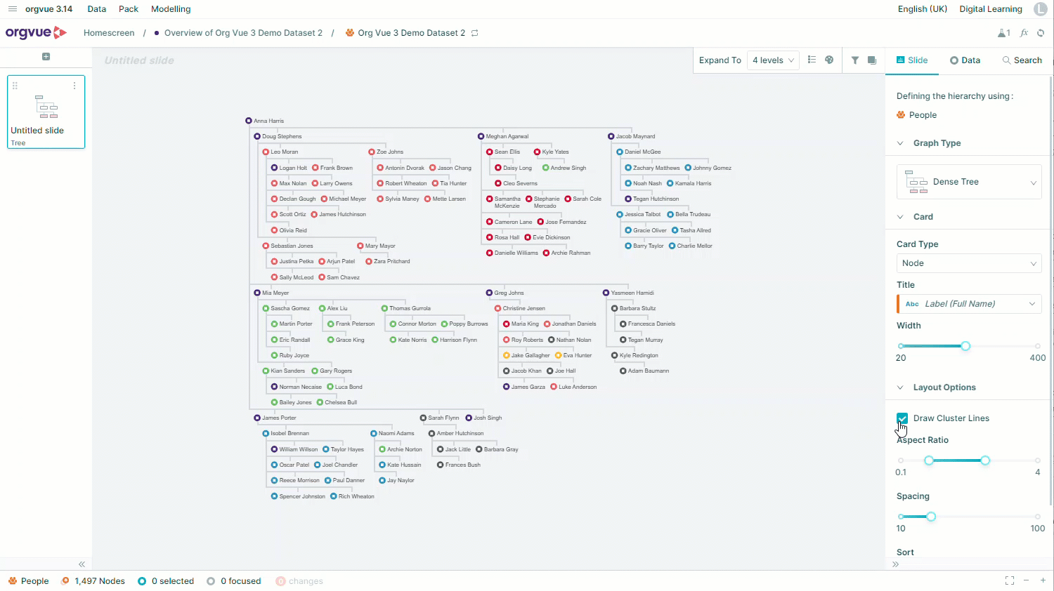
Dense Tree
This graph type displays nodes grouped closer together and may be useful when trying to display trees with high numbers of nodes shown
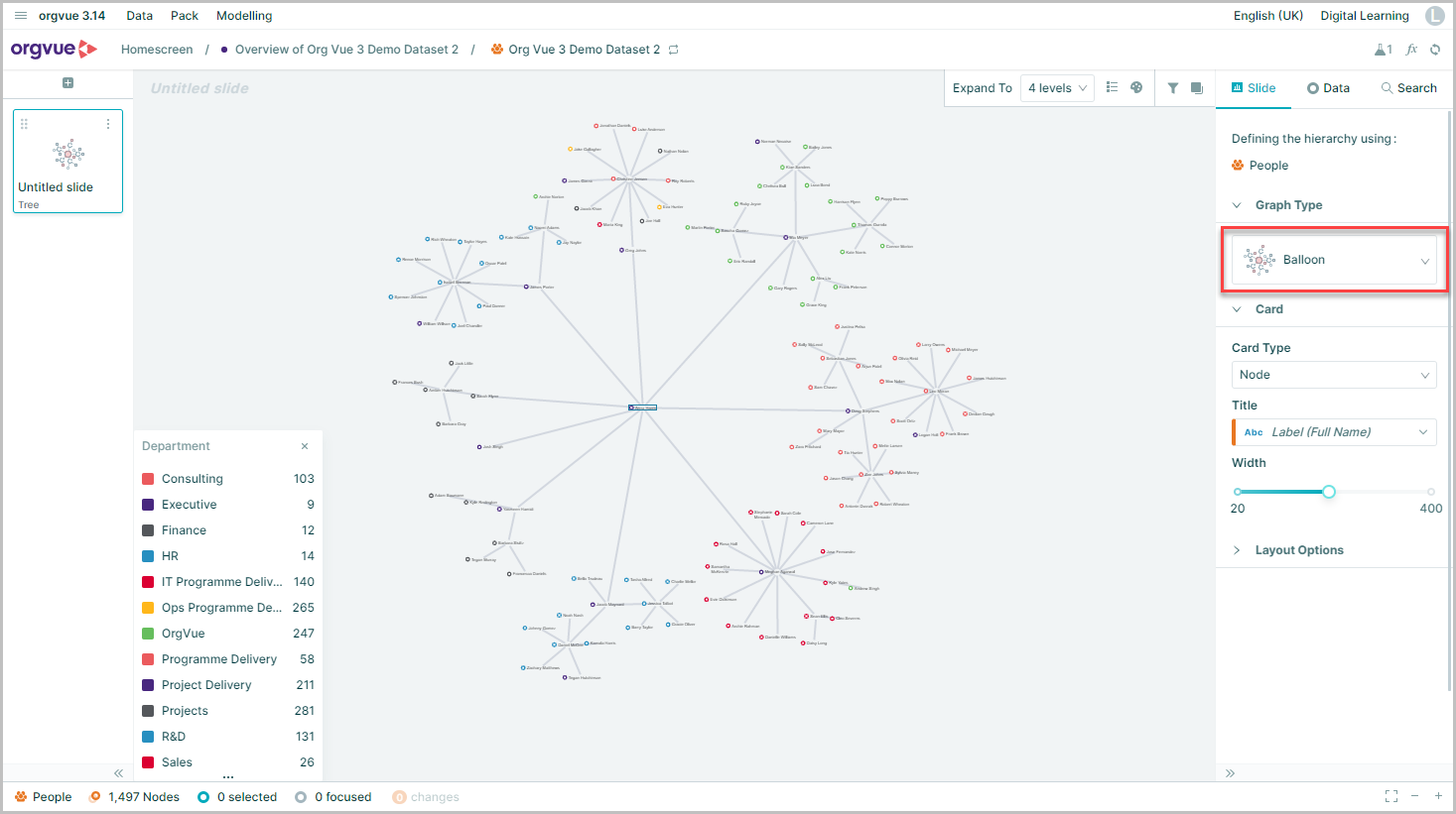
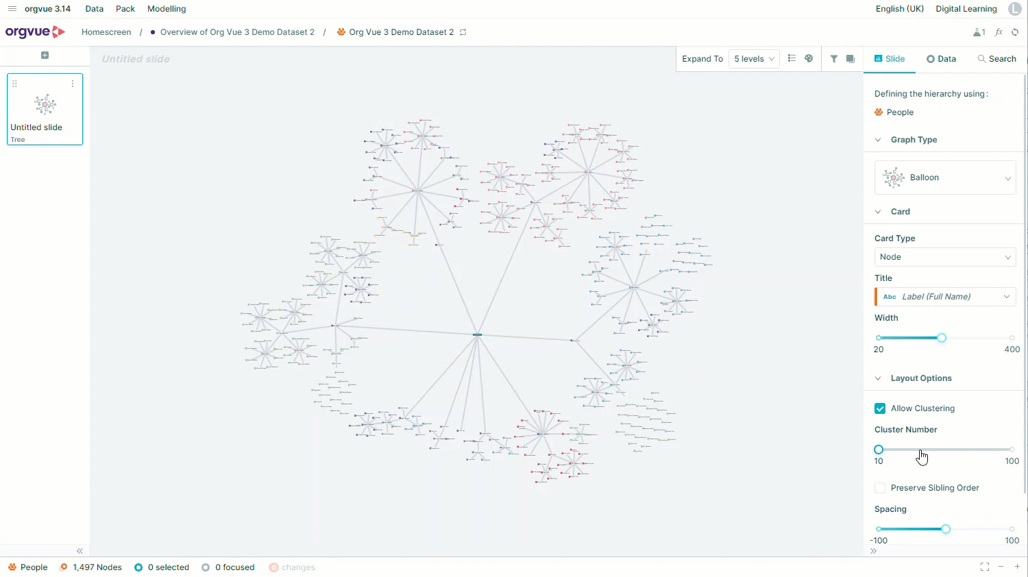
Balloon
The Balloon tree is a variation of radial tree and displays the root node at the center of the graph with children nodes drawn in a circle center ed on their parents
This type of tree is effective at showing the tree structure but at the cost of node details
Radial
The Radial tree displays the root of the tree at the centre of the canvas with children nodes at each depth expanding out radially from it
Similar to the Balloon tree, it is effective at showing the tree structure but at the cost of node details being displayed
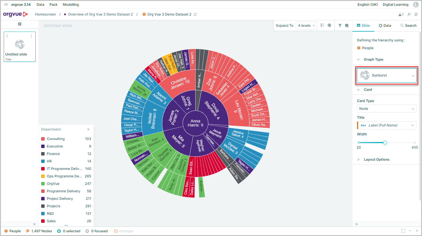
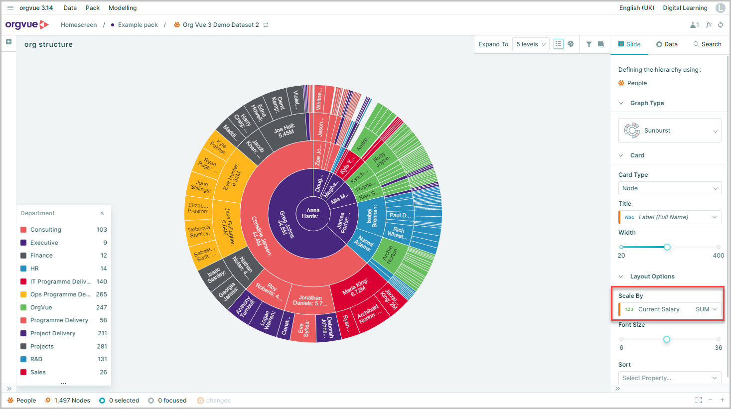
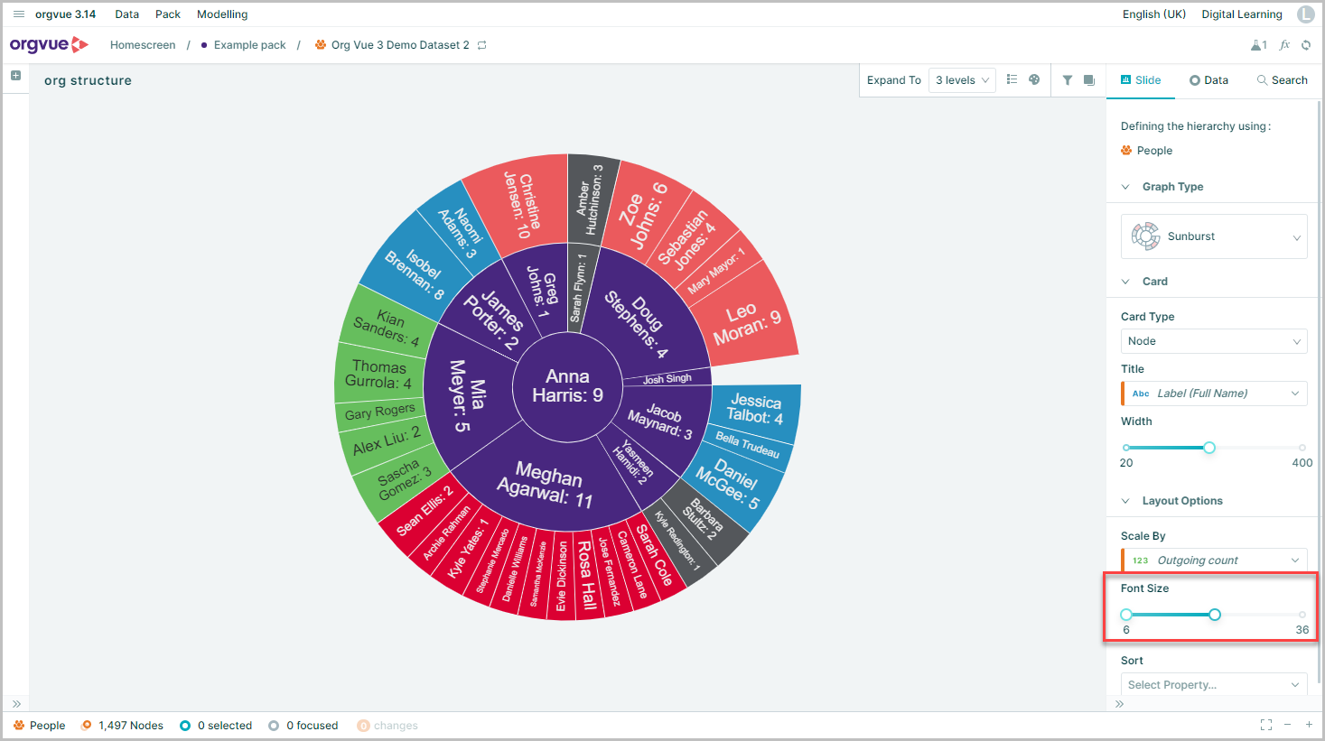
Sunburst
This type of visualization shows hierarchy through a series of rings, that are sliced for each node
Each ring corresponds to a level in the hierarchy, with the central circle representing the root node and the hierarchy moving outwards from it
Rings are sliced up and divided based on their hierarchical relationship to the parent slice. The angle of each slice is either divided equally under its parent node or can be made proportional to a value
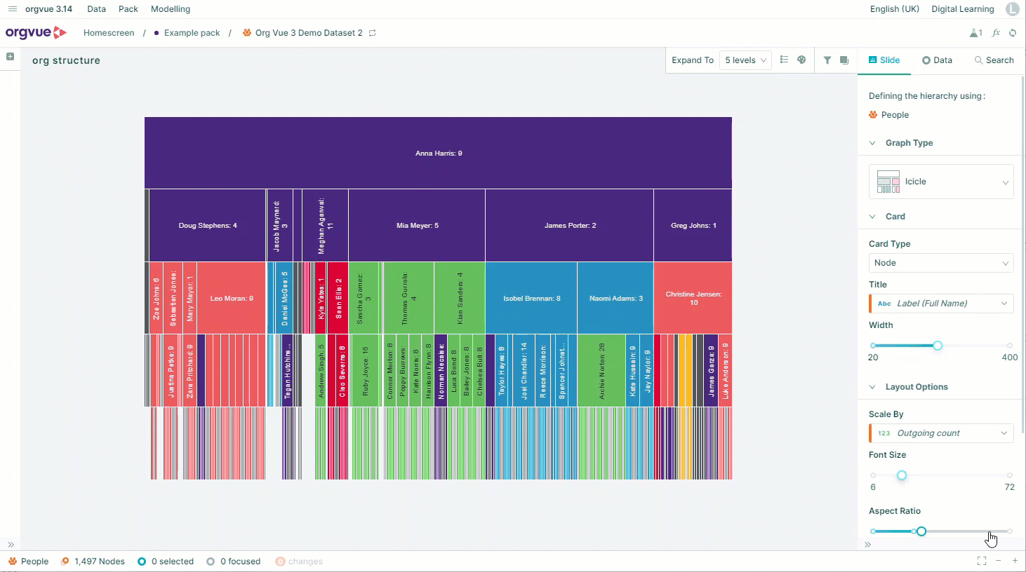
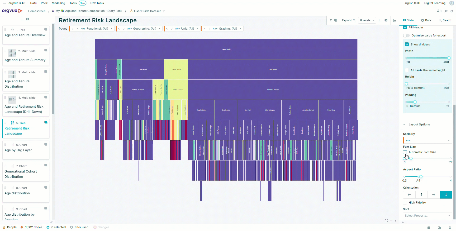
Icicle
The Icicle Tree visualizes the hierarchy where nodes of a tree are represented by adjacent rectangles laid out progressively according to their depth
The biggest rectangle on the top represents the root node
The children nodes are placed under their parent nodes. Each node’s width is determined by a sum of its children’s width
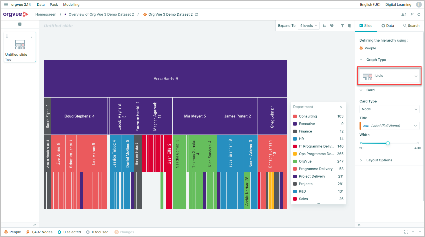
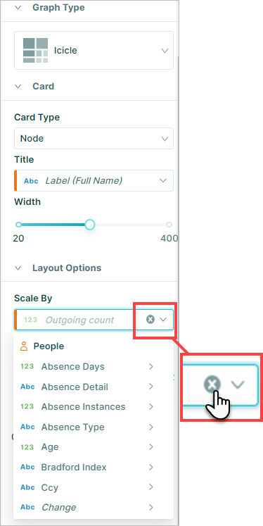
By default, the Icicle tree segments are scaled by outgoing count, but this can be changed or removed using the Scale by option within the Layout Options
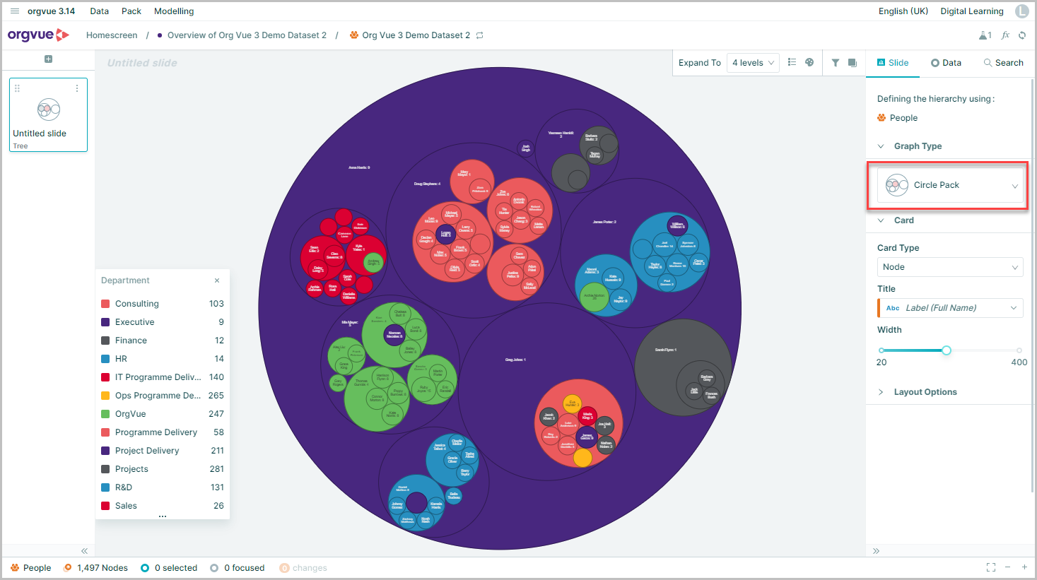
Circle Pack
The Circle Pack displays the hierarchy in a series of circles within circles, with the root node forming the largest outer circle and each branch is shown as a smaller circle within its parent circle
The size of the circle corresponds to the size of the branch or other value if selected
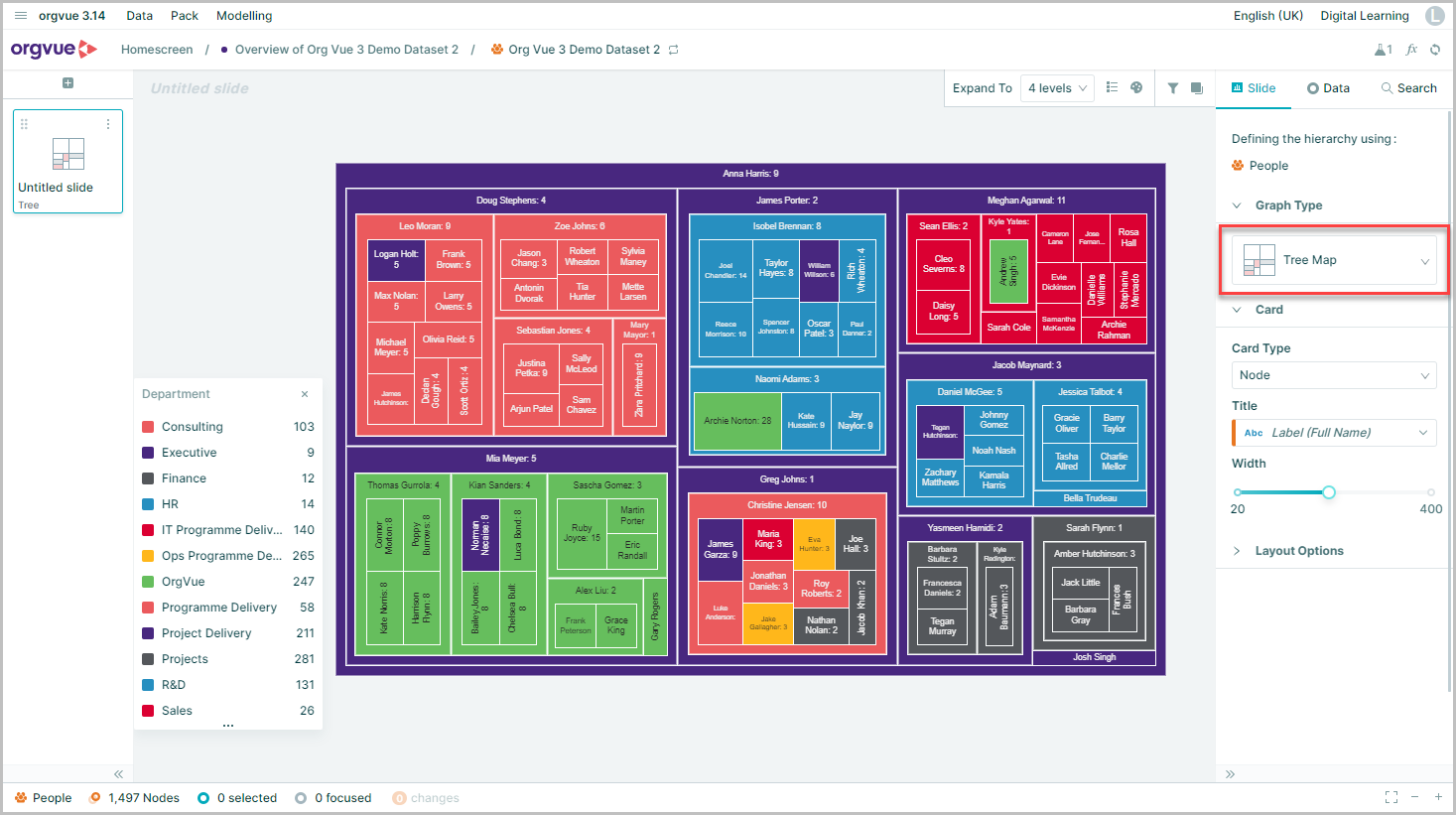
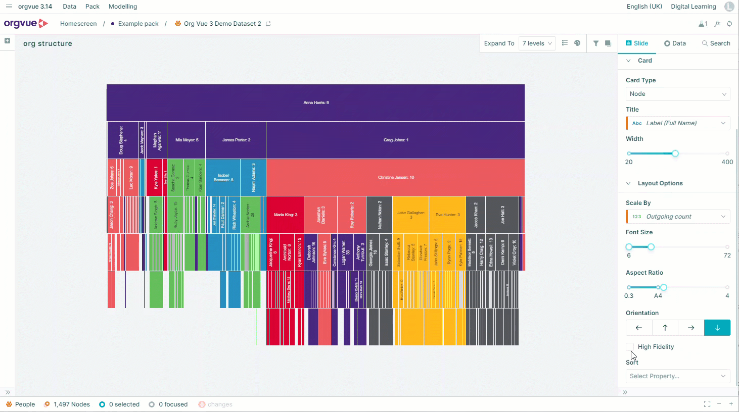
Tree Map
The Tree Map displays nodes as a set of nested rectangles
Similar to the circle pack, each branch of the tree is shown as a rectangle, with the root node forming the outer rectangle which is then tiled with smaller rectangles representing sub-branches within them
Zoom and Fit
Available on all Tree slides
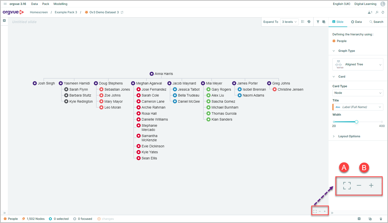
On a Tree slide you will see Zoom and Fit controls, which allow you:
- A. Fit the tree to the screen
- B. Zoom in and out
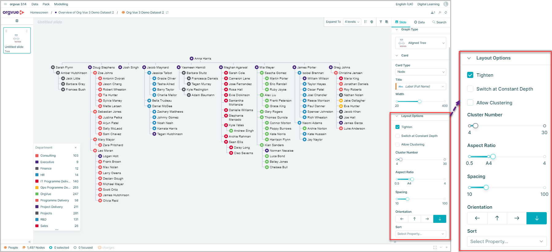
Tree Slide Layout Options
Dependent on the Graph type selected, the Slide Tab on the right-hand panel provides a number of options to customize the layout of your tree in different ways
Note: As not all options are available on all graph types, each feature lists the graph types it is available on
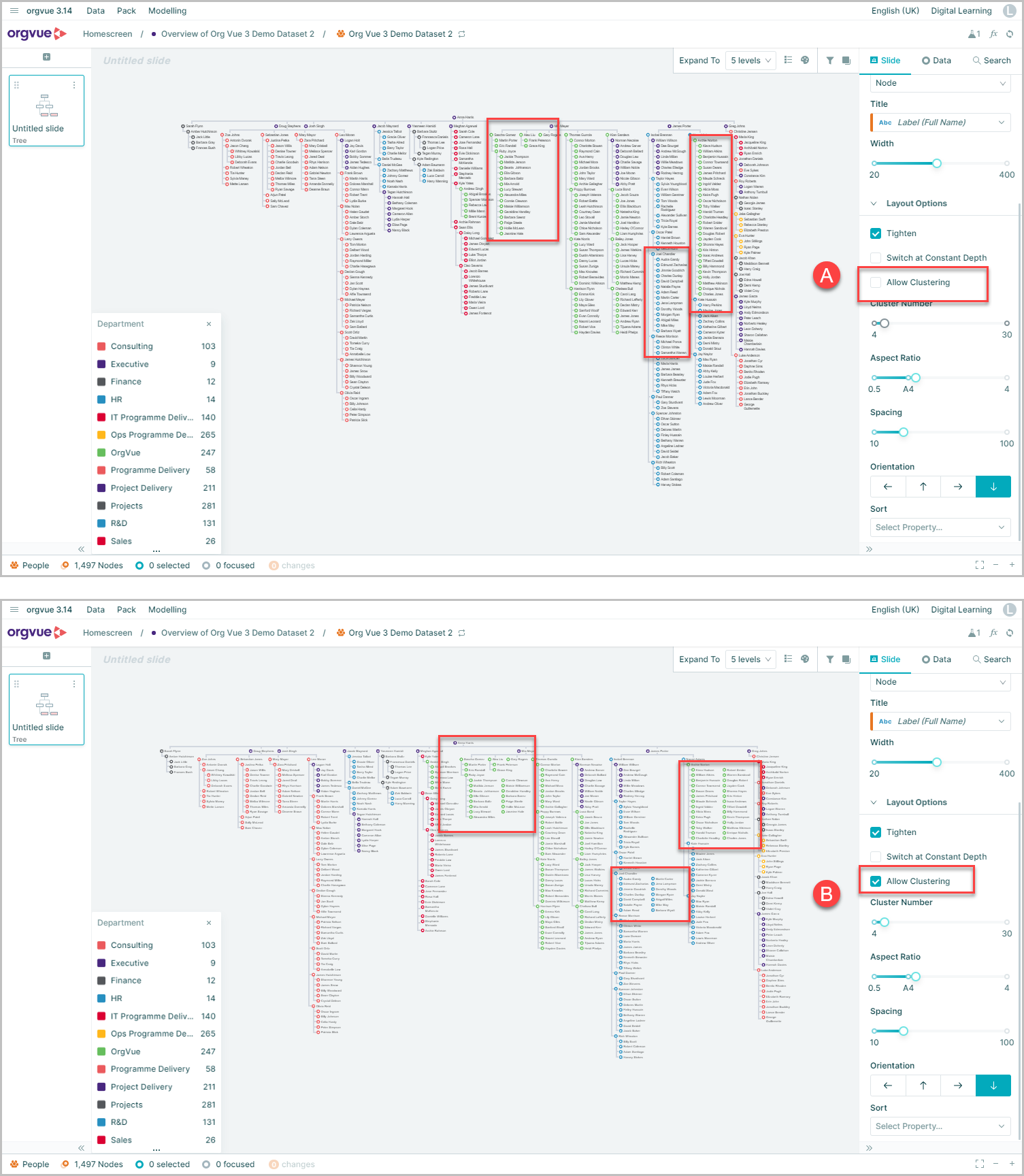
Allow Clustering
Aligned Tree, Balloon, Radial
This allows you to adjust the vertical length of branches within the tree - by placing nodes with a common direct descendant either side by side or stacked on top of each other
This example shows the same data on an Aligned Tree with the option:
- A. Allow Clustering Off
- B. Allow Clustering On
Draw cluster lines
Dense Tree
Leaf nodes sharing the same parent are described as clusters. By default, this is selected on a Dense Tree forcing the tree to be drawn with all of these lines shown
Deselecting this option means the tree is drawn without all connecting lines for these clusters of nodes
Cluster number
Aligned Tree, Radial
This option is used in conjunction with the Allow Clustering function to define the maximum number of nodes permitted within a cluster before all lines are shown
Increasing this value will force any clusters that are smaller than the set value to display all lines
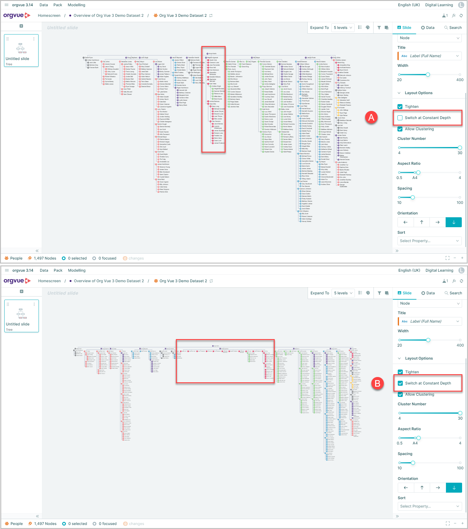
Switch at constant depth
Only on Aligned Tree
Optimizes the number of nodes displayed in conjunction with the Aspect Ratio, i.e. wider aspect ratio = more children nodes displayed horizontally
The effect on the nodes highlighted can be seen here with
- A. Switch at Constant Depth = Not selected
- B. Switch at Constant Depth = Selected
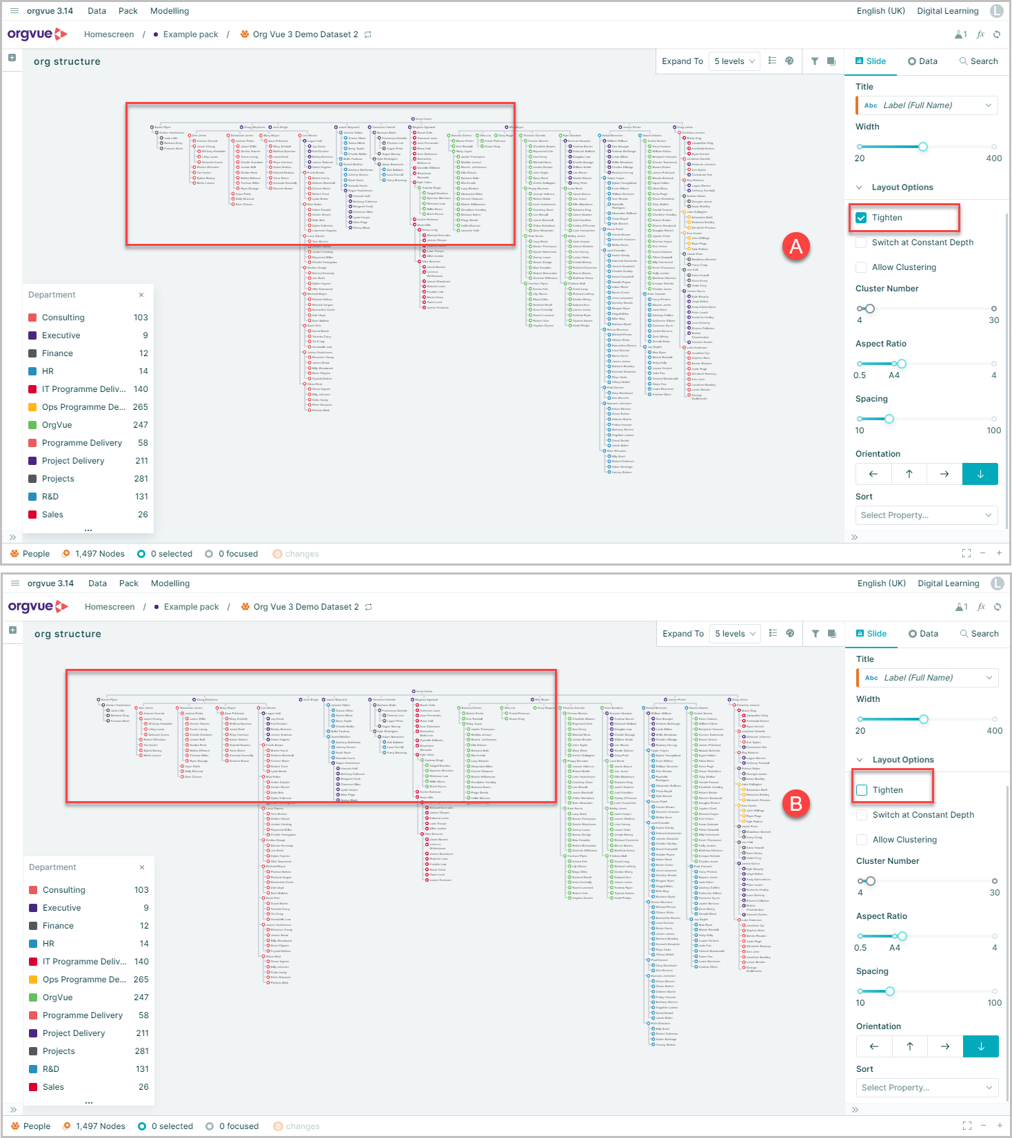
Tighten
Only on Aligned Tree
Closes the space between horizontal nodes to decrease the overall width of the tree
- A. By default this is selected on an Aligned Tree
- B. Unselected
Aspect Ratio
Aligned Tree, Dense Tree, Icicle, Tree Map
A single slider point that you can use to define the width of your tree on your canvas
Preserve Sibling order
Only on Balloon
Retains the order that sibling nodes are listed on worksheet view when drawing tree
Spacing
Aligned Tree, Dense Tree, Balloon
Changes the space between the nodes on a tree
Scale by
Sunburst, Icicle, Circle Pack, Tree Map
This sizes the segments in the tree based on the selected measure. Using the sub-menu it is also possible to size by the aggregate of a measure
In this example the segments are sized based on the Sum of Current Salary. This uses the hierarchy to sum the salary for each node and any descendants of that node
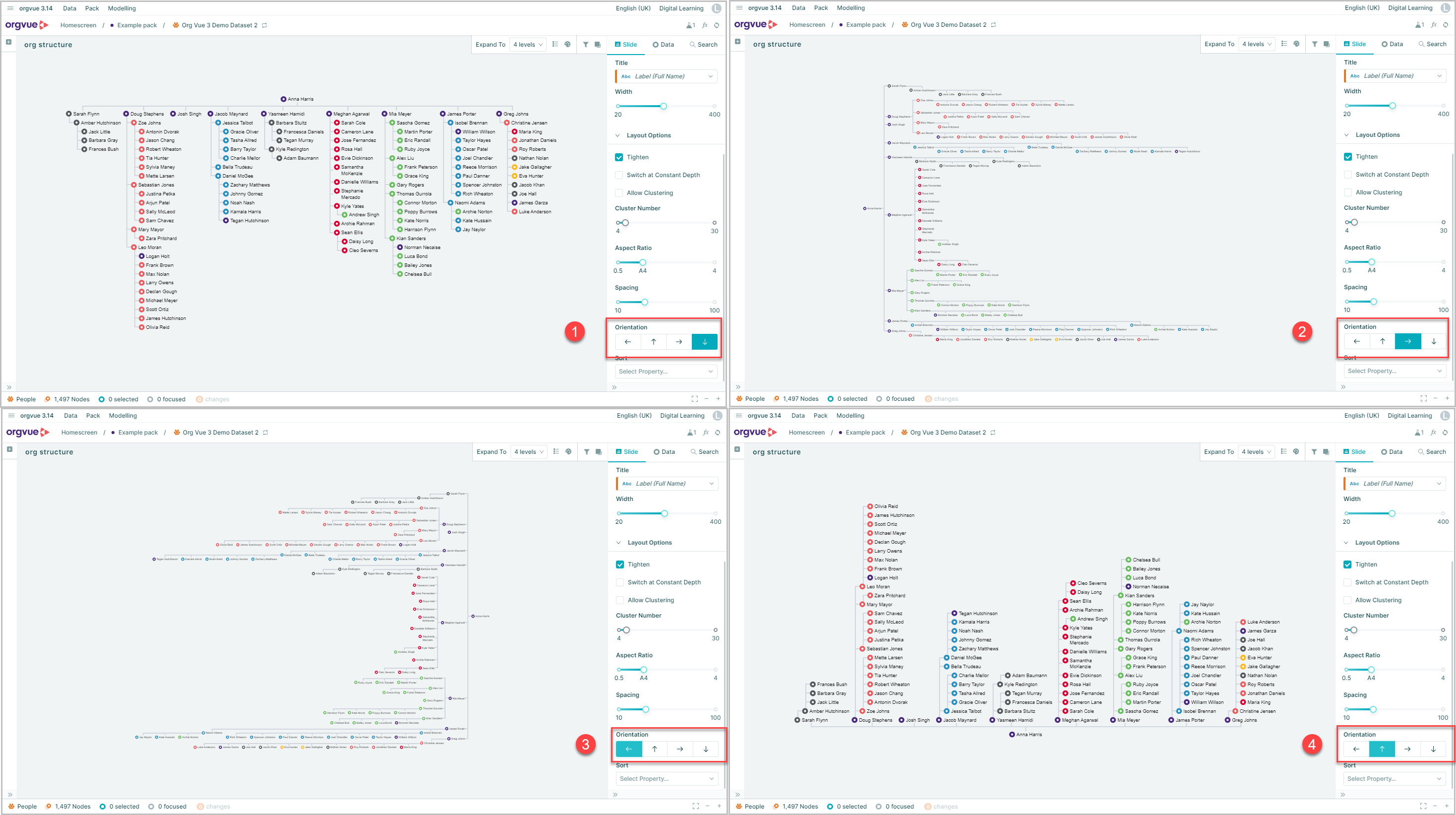
Orientation
Aligned Tree and Icicle
Gives you four options that allow you to switch the orientation of your graph
Font Size
Sunburst, Circle Pack, Tree Map, Icicle
The two slider points allow you to set the min and max font size for the label text on the cards
These will then be used to provide the best fit for the labels on the graph
Automatic Font Size
Icicle Tree Only
In addition to using the slide to set the Font Size, the Icicle chart also has the option to allow Orgvue to automatically adjust font size to provide the optimal font for each section
Select the Automatic Font Size checkbox within the Layout Options to use this feature
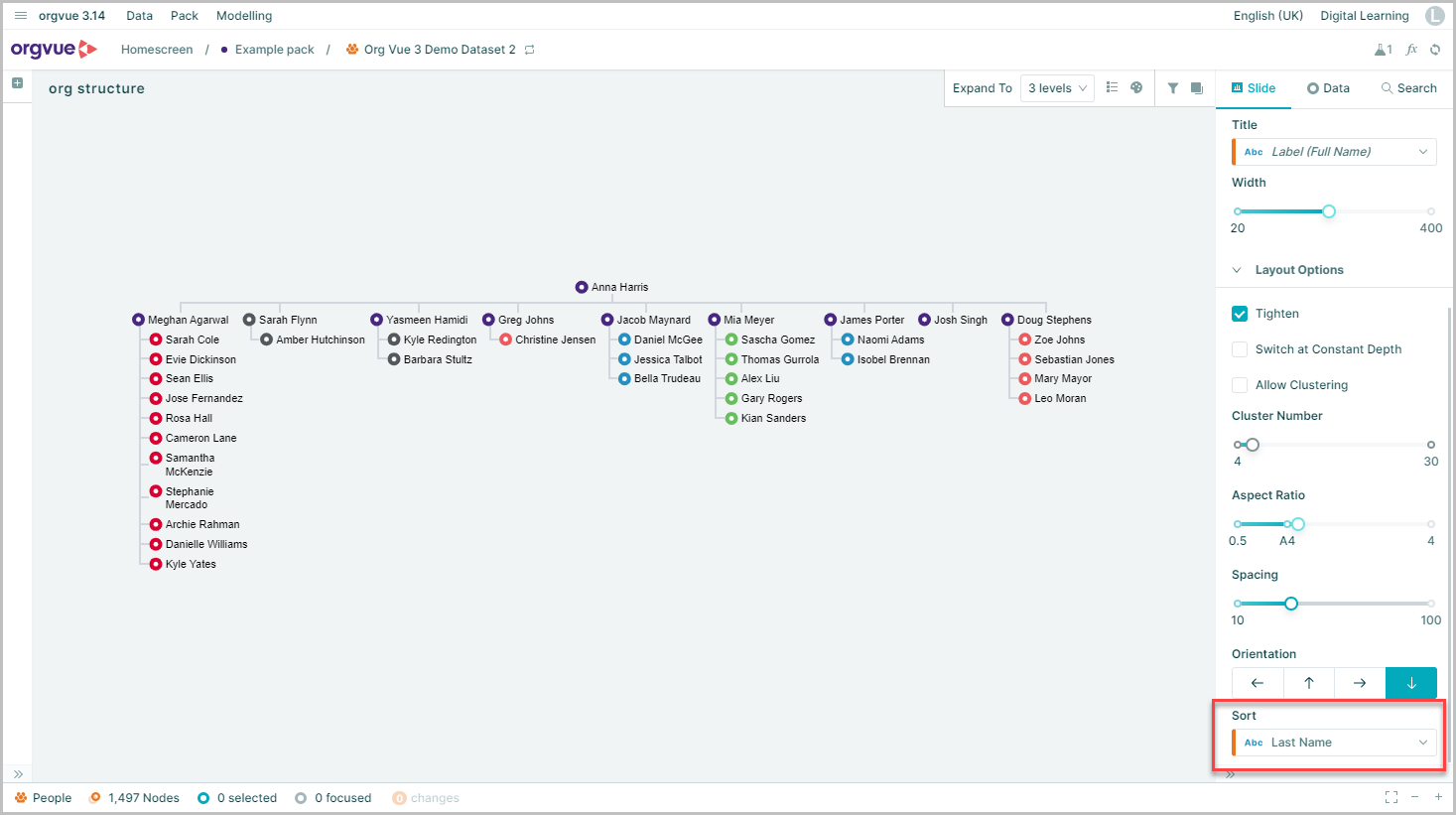
Sort
Aligned Tree, Dense Tree, Balloon, Radial, Sunburst, Icicle
Enables you to sort the order of displayed nodes at each depth of tree by the selected property value
If no sort property is selected then nodes are displayed in dataset order
In the example shown nodes are sorted at each depth of the tree by last name
High Fidelity
Only on Icicle
Enabling this option increases the level of detail you see as you zoom in
When not enabled, the lower level of icicle charts with a high number of nodes and levels will show as solid blocks
For large trees, High Fidelity drawing will be slower
Note: When exporting slides to PowerPoint using the High Fidelity option, the ability to zoom in to see more detail will not be available on the exported slide
Maximum Rectangles
Only on Tree Map
The slider control adjusts the maximum number of rectangles displayed on tree map
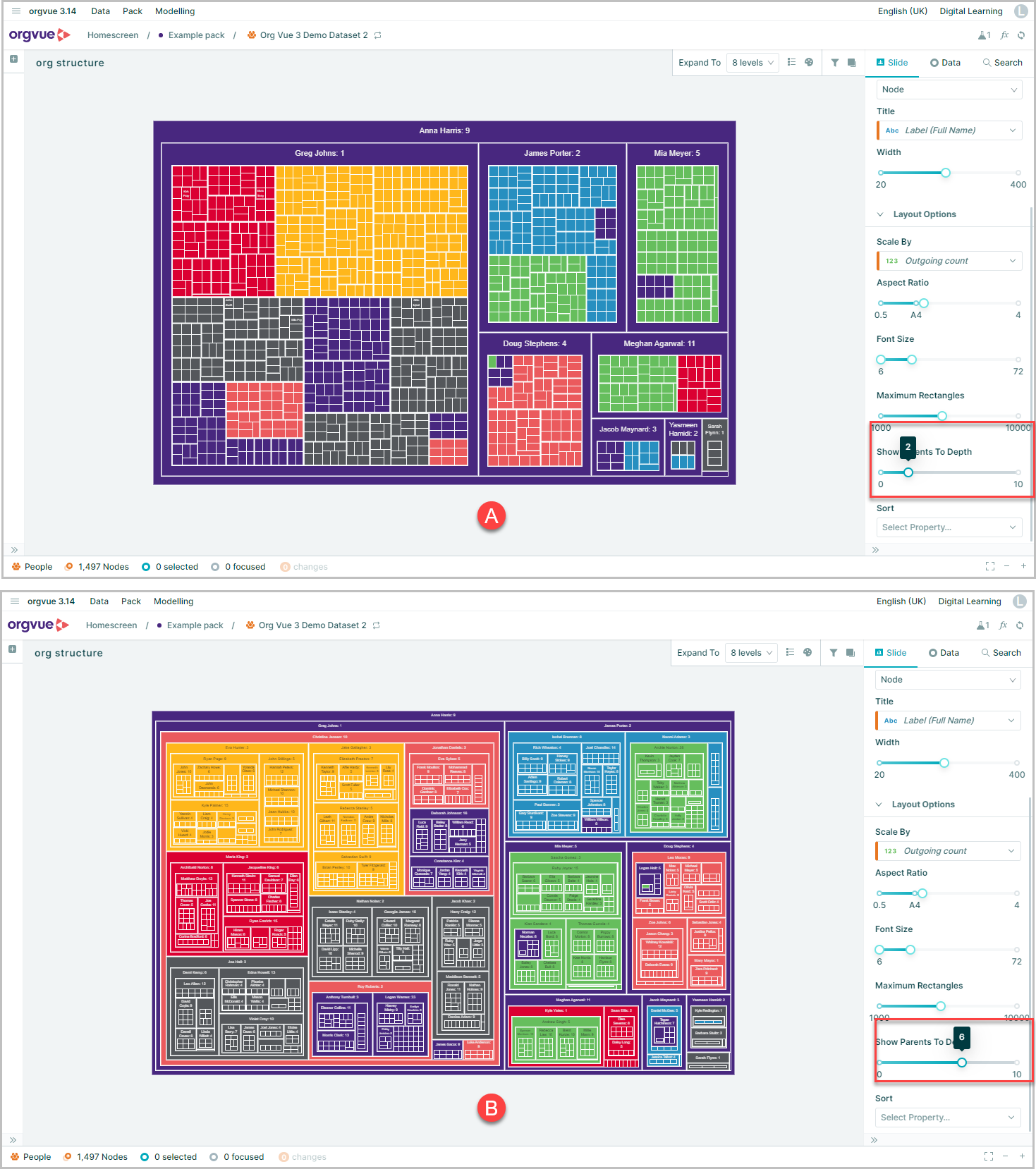
Show Parents To Depth
Only on Tree Map
When more than one level is displayed in the tree map, this control alters how many levels of parents are shown
Depth shown is from root of tree, e.g. setting to 1 shows the parent at level one of hierarchy. Setting to 3 will display parents at levels 1, 2 & 3
In the example Show Parents To Depth is set to:
- A. 2
- B. 6
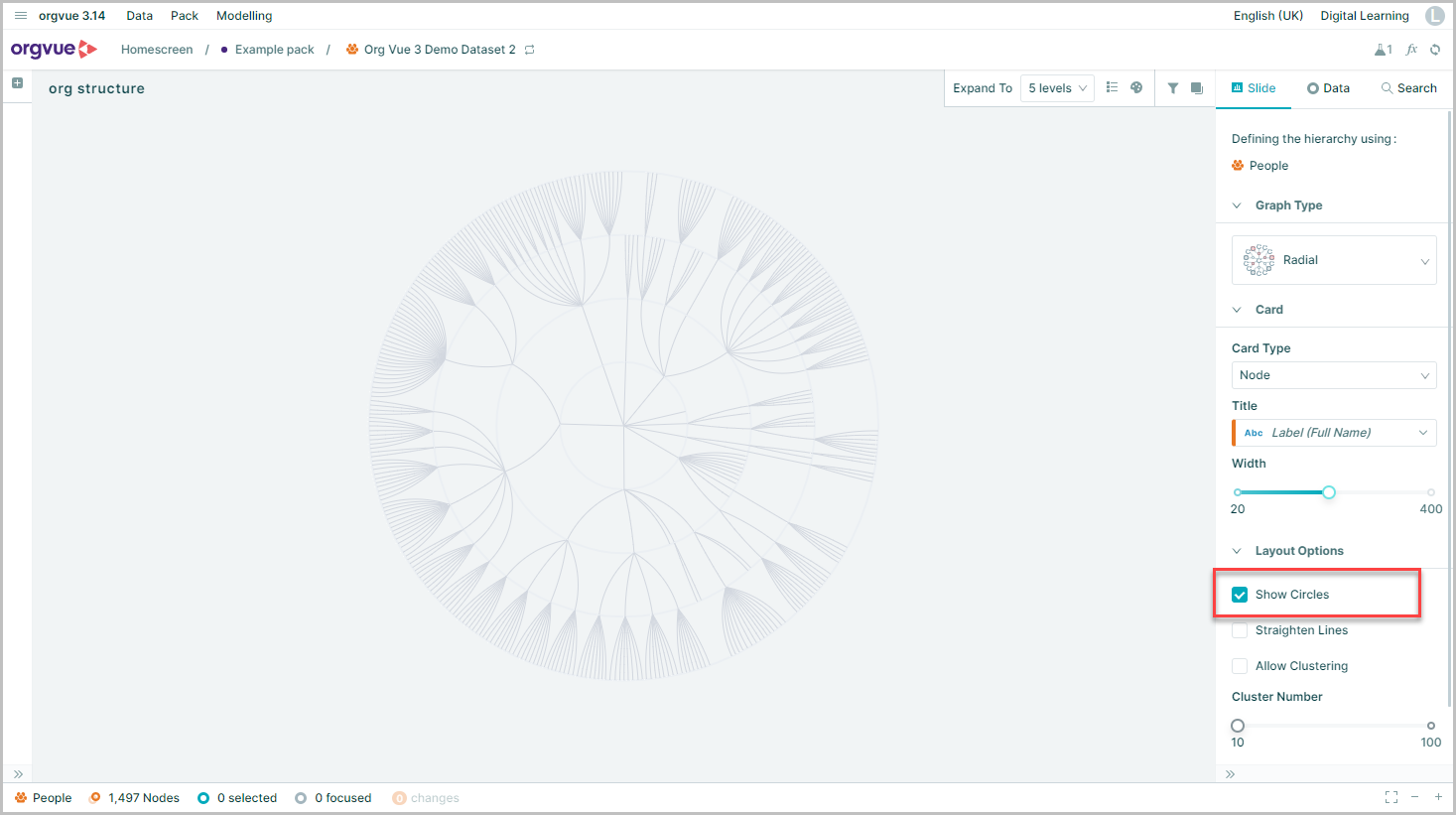
Show circles
Only on Radial
This option is not selected by default, but when enabled it draws a faint circle that intersects the nodes at each level of the tree
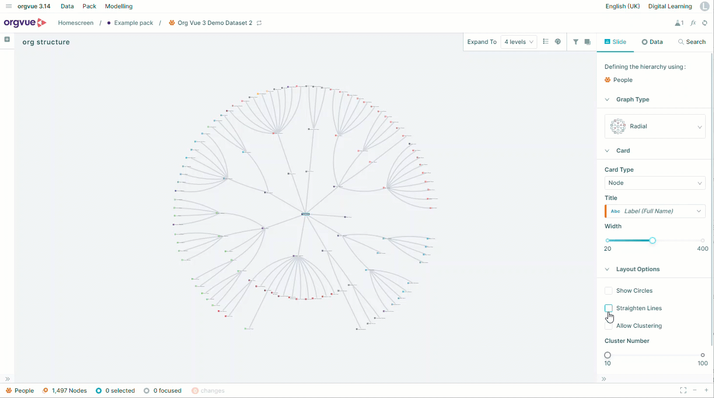
Straighten Lines
Only on Radial
By default, a Radial Tree is drawn with curved lines connecting nodes, this option allows these connecting lines to be shown as straight instead
Show Links
Only available on Summary Card when working with a Linked Dataset
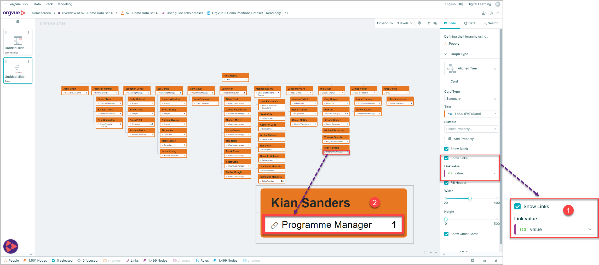
- Select the
Show Linkscheckbox - The Link Value selected in the dropdown will be displayed on the Summary Card
Link Value
Only available on Summary Card when working with a Linked Dataset
With the Show Links checkbox selected it is possible to then select the link value to be displayed on the summary card from the dropdown list
Card Types
Nodes on tree slides can be displayed with different levels of detail shown by selecting the card type on the right-hand slide panel
Each card type will allow different options to further customize it
Note: Card types may be selected on any tree type but will only display on the tree visualization on Aligned, Dense, Balloon and Radial trees. On other tree types the selected card will only be shown when hovering the mouse on the node in the tree. In addition, the maximum number of interactive node cards that may be displayed is 500
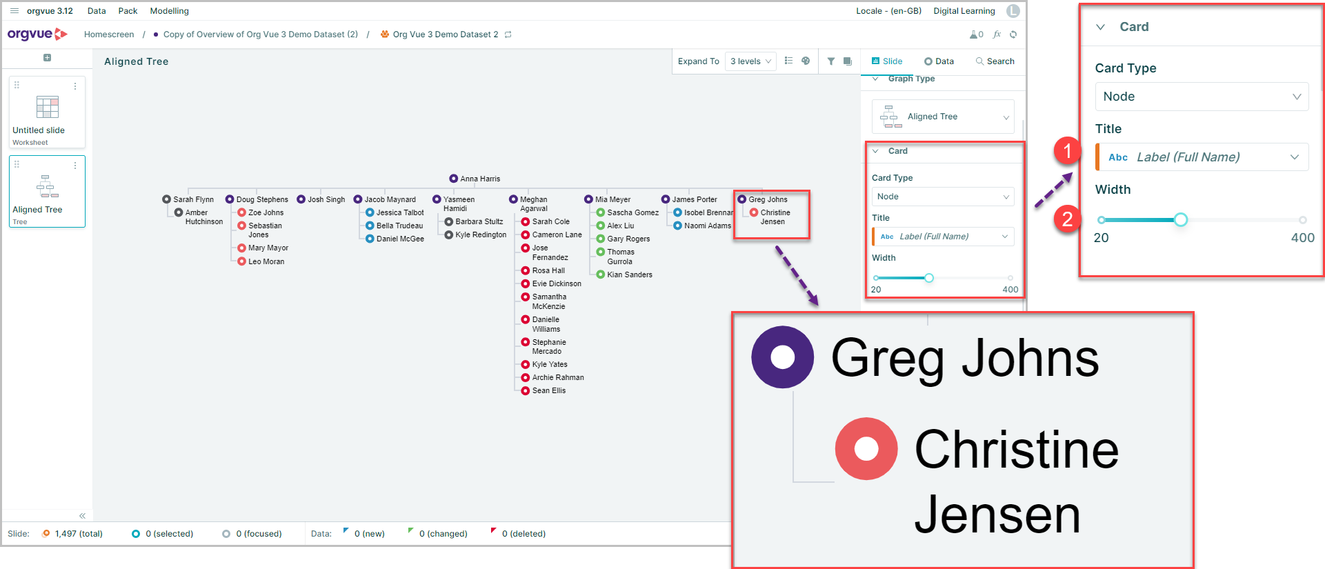
Node
A Node card is a simple card with a circle node which can be colored based on a property
There are two options available to select on a Node card
- Title: A single property can be selected to be displayed as the Title of the card
- Width: Slider control to adjust the width of the displayed card
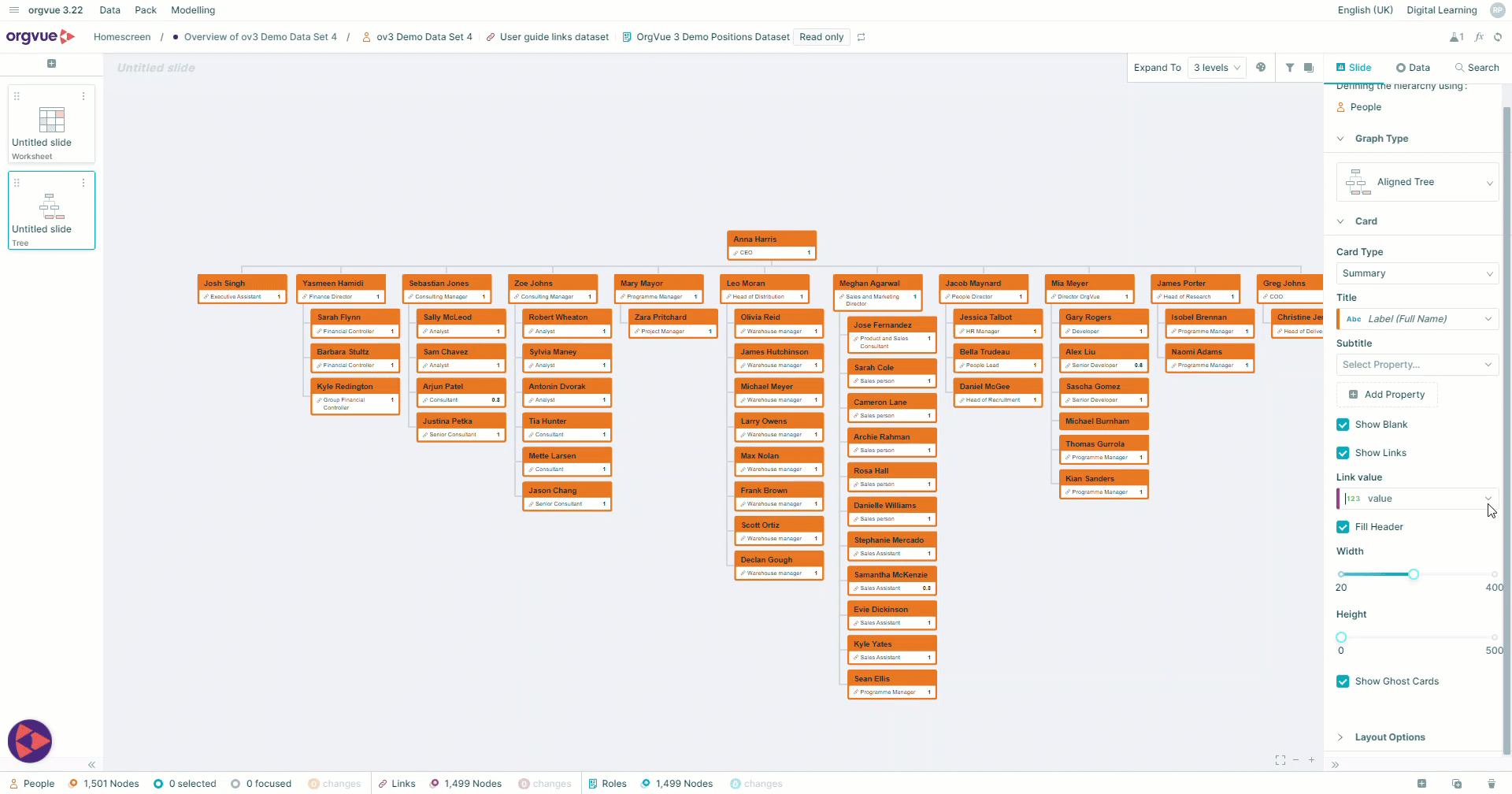
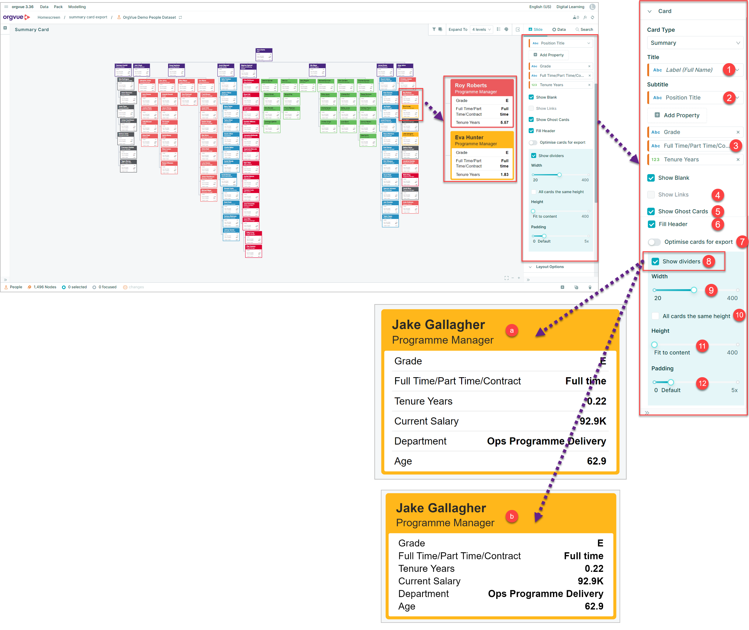
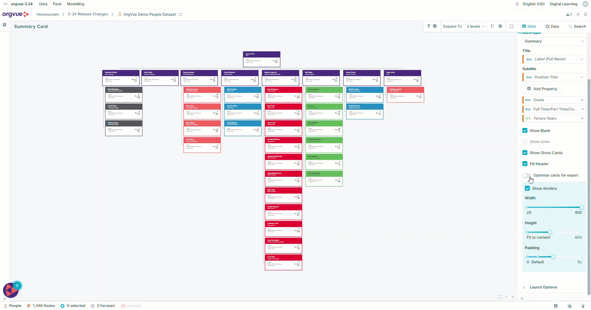
Summary
A Summary card allows you to display multiple properties on your card with multiple options
- Title: drop-down menu to select property to be displayed as title on card
- Subtitle: allows you to choose a second property to display from your list of properties
- Add Property: enables you to add multiple properties to your card. When adding properties it is also possible to add roll-up metrics and this includes adding multiple roll-up's of the same properties
- Show Links: When working with linked datasets selecting this option will display the linked values on the card
- Show Ghost Cards: this option allows you to either show full summary card detail on ghost node cards or, when unselected, ghost nodes will display title and subtitle only, with no header fill
- Fill Header: this option fills the header bar of the card based on color palette selected
- Optimize Cards for Export
- Show Dividers: Checkbox option to display summary card either:
- a. With divider lines between each row on summary card
- b. Without dividing lines
- Width: slider control to adjust width of card
- Height: Slider control to adjust height of card
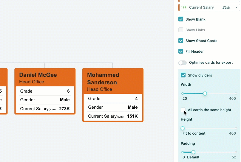
- All cards the same height
- Padding: Slider control to adjust left and right indent of text on card
Optimize Summary Card For Export
There are a number of controls available on the Summary Card to adjust the width, height and padding of the card as well as the option to display dividing lines between rows of data on the card
Adjusting these may make the card shape and size less than optimal for exporting to PowerPoint from Orgvue
To override these settings and allow Orgvue to set the best settings for exporting the summary card
All cards the same height
When working with summary cards with multiple properties displayed they may appear as different height cards within the tree
Use this toggle switch to ensure all summary cards are of a unified height in Orgvue
They will remain this way during export
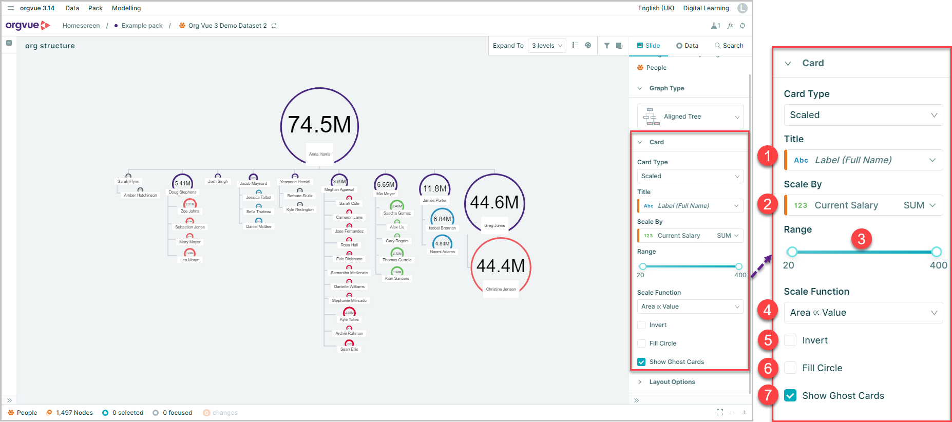
Scaled
A Scaled card is displayed as single title property card with a circle node that is scaled based on the size of a selected measure
When you select Scaled as Card Type you have seven customization options:
- Title: drop-down selection of property to display as card title
- Scale By: drop-down selection of measure to scale by, either as a measure for individual node or aggregated for descendants of node
- Range: two point slider control to adjust the min and max size of circles. A narrow range will make most circles similar sizes, while a wider range emphasizes the difference in measure to a greater extent
- Scale Function: Drop down selection provides similar functionality to range control based on specific calculations:
- Logarithmic is ideal when the range is large e.g. salary, and you want to smooth out those large differences, e.g. you can visualize the PA in the same tree view as the CEO when scaled by salary
- Radius does the opposite, and will emphasize the differences the most, e.g. Double the salary = double the radius. The CEO circle is significantly larger than the PA circle
- Area sits in the middle of these two, e.g. Double the salary = double the area. The interpreted size (area) matches the salary
- Invert: this function simply switches the scale to make the smallest measure the largest circle
- Fill Circle: fills the circle with selected color palette
- Show Ghost Card: displays greyed out scaled card for ghost node when selected
Export Tree
When a Tree Slide is exported to PowerPoint the Slide text and nodes displayed on tree are editable objects within PowerPoint